Exhibition Boards
I knew, since I was a programmer, I wanted a mix of things on my 3 boards which I was limited to, there wasn’t much work which I made for this final project which I feel would  stand out on a board since a game, I feel is much harder to present than some 3D modelling or art work, this is because a game is meant to be playing like a movie, it’s not supposed to be a still image, from looking at this wall from the exhibition, I really liked how this person has used 3D modelling for a board, artwork for another and a screenshot of the game for another, so I wanted to do the same.
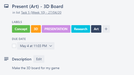
Present (Art) – 3D Board
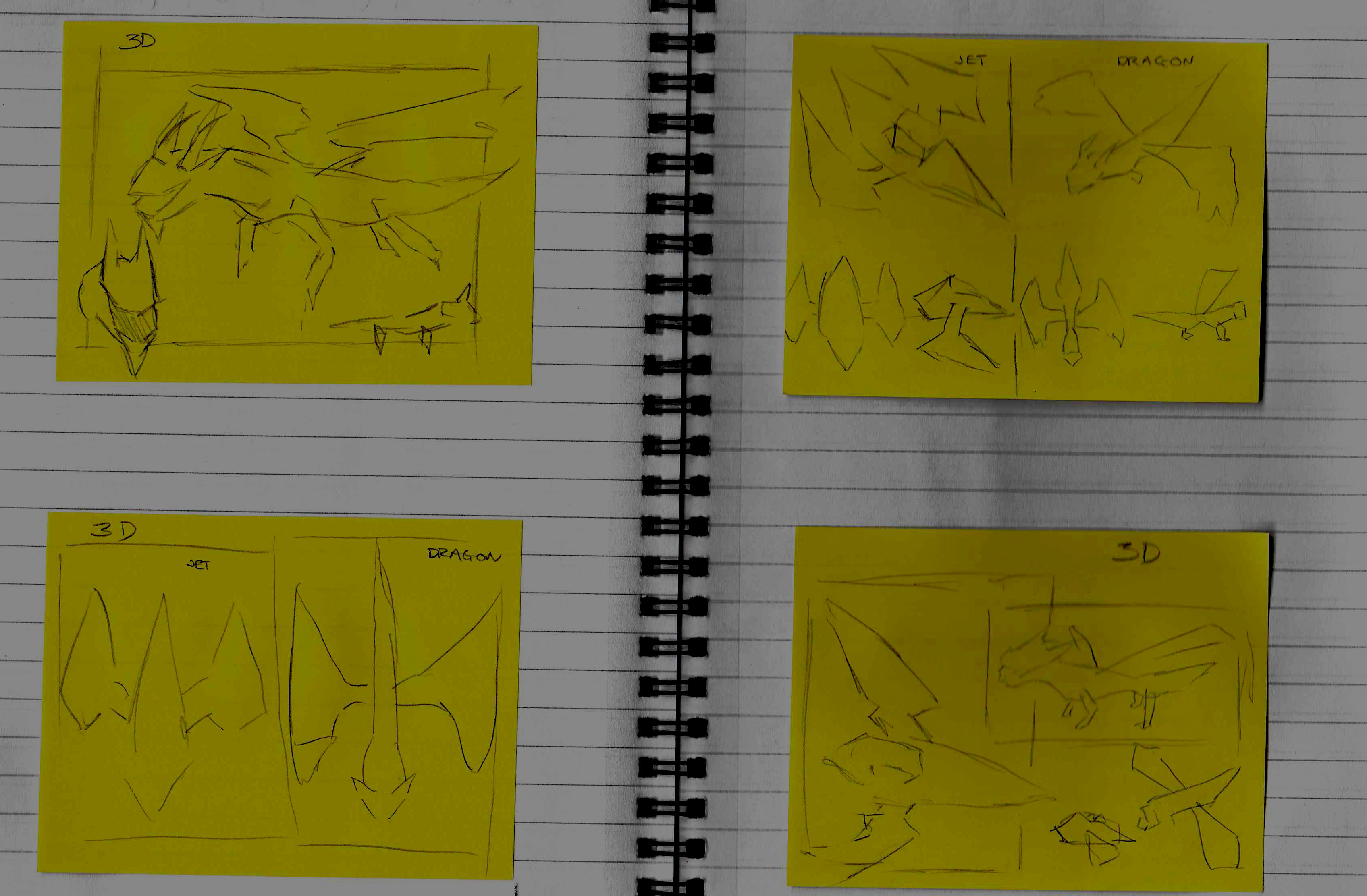
I started my planning by sketching really rough ideas onto a few post-it notes. These aren’t perfect, but it’s just me planning out how I can present my final project before I go ahead and start making it.
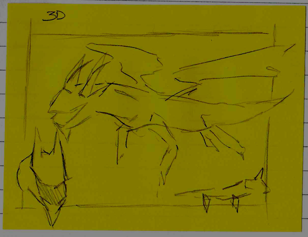
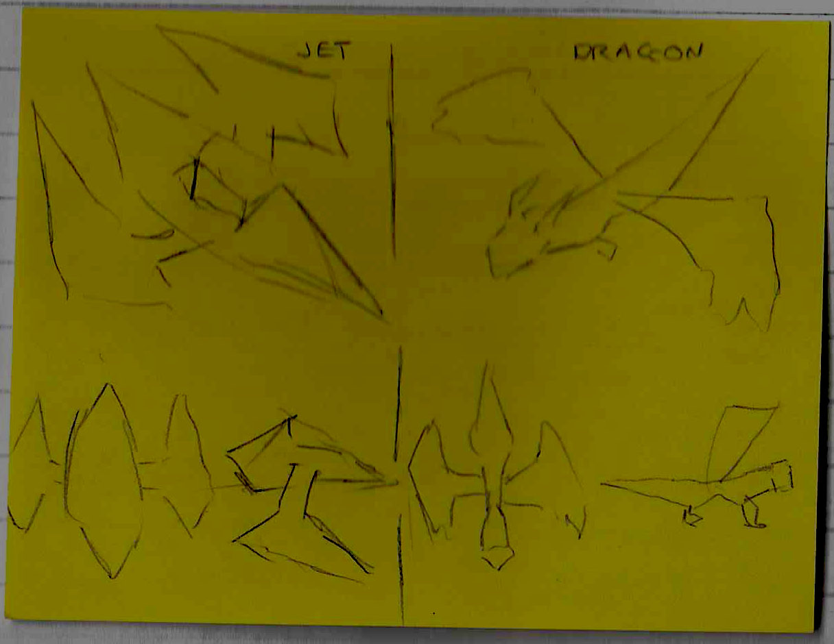
Sketch Plan 1
- What do I like about this layout/renders?
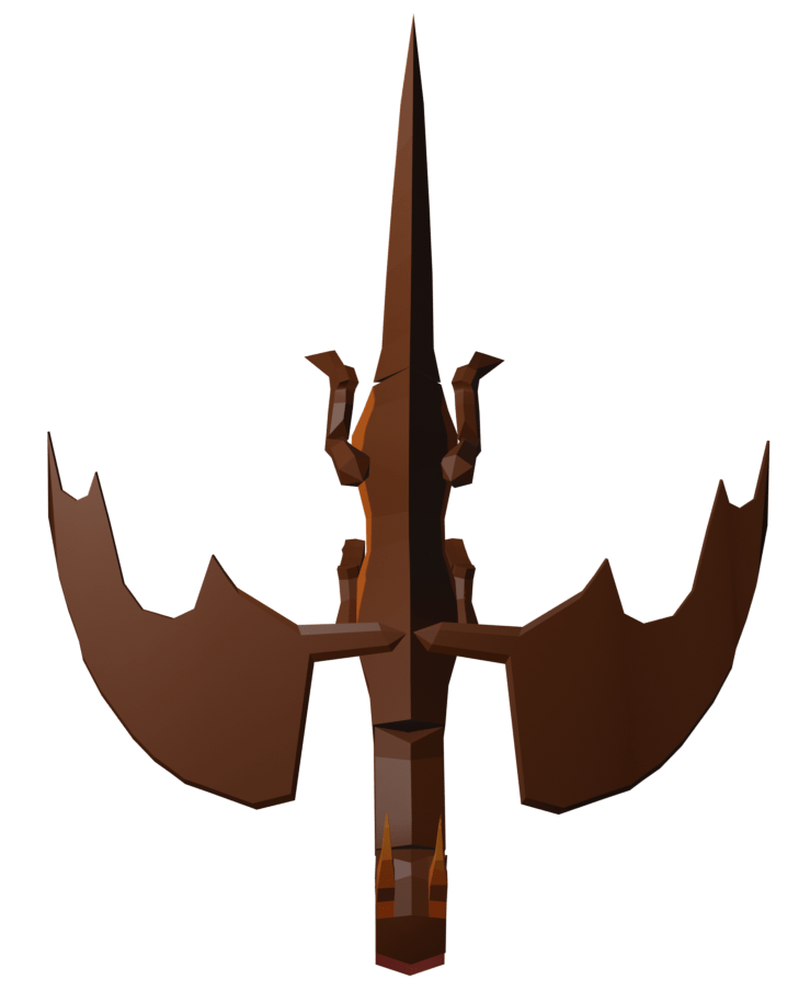
On this sketch, I really like how the dragon is clearly presented in all it’s glory, a large render of the dragon at 3/4 view, a headshot and a side-view, this allows the person viewing your work to see every important detail of your model without seeing it a 3D rendering software.
I also really like how the dragon which is in 3/4 view is the main focus of the sketch since it would really draw your attention to that first, which is what I would want.
I also really like the boarder I drew around the edge, I think it really gives character to the piece if parts of the model poke out of the board.
- What don’t I like about this layout/renders?
I don’t think my dragon is detailed enough to be presented this way, I didn’t take the 3D route, so my 3D for my game shouldn’t be glorified like this since it’s not the best 3D which I feel I could produce, I feel like there’s too much focus on just one model, and if I want to present my models I should present multiple on one board so the main focus isn’t just one model.
- What could I add to make this look better?
I think small annotations added to this board would make them look better, although I don’t think annotations are too necessary since you can clearly tell what this is.
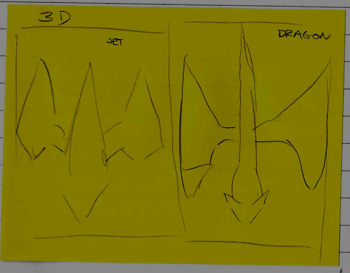
Sketch Plan 2 –
- What do I like about this layout/renders?
I like how this plan is equal for both 3D models, they would take up the same space being in the same pose, I like this because it’s consistent, and shows both models from one view, I really like this idea.
- What don’t I like about this layout/renders?
I don’t like how minimal it is, there could be so much more that could be added to it, there’s a lot of white space, and I also feel like, since the ship would have a smaller width than the dragon, this would end up looking out of place and wrong, I also don’t like the boarders which I drew on this.
- What could I add to make this look better?
I think I could keep this idea, but not as the main focus, I could have the models both be top down as something small in the corner of a bigger board presenting a few more poses and angles of both the models.
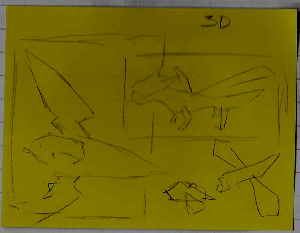
Sketch Plan 3 –
- What do I like about this layout/renders?
I like how this layout shows both the models in my game in detail, and I like how it manages to fill up all the space in the board and all the images are at a balanced size so both models get the same amount of attention.
I also really like the boarder in the middle and how it handles overlaying models.
Overall I think this is my favourite board, since it covers all the areas I’ve wanted which the other 2 boards haven’t
- What don’t I like about this layout/renders?
There’s nothing which I don’t like about this board, but I don’t know how this would turn out when I’ve got rendered pictures of the characters yet since I haven’t messed with the scaling, so it could be that the top down renders on the bottom are too wide which means they may need to be shrunk to fit, and some things may need to be moved around.
- What could I add to make this look better?
I feel like some annotation would look really nice in this plan, but other than that, I don’t think it’s missing anything, obviously I haven’t planned a background yet, but that would be something which I do later on.
Sketch Plan 4 –
- What do I like about this layout/renders?
I like this one just as much as I like the previous plan, I like this one since it features a range of poses from both the models, both the dragon and the jet have their big render and their smaller render, I really like how the dragon overlays the jets render picture. I also really like the boarders they make the plan feel very playful. There’s a lot which is presented on these boards which allows people to see the full glory of these models
- What don’t I like about this layout/renders?
I don’t like how the other 2 models are crammed in the corner of the picture, but this can be messed around with until I find something which I like.
I feel like there is a lot of white space near the top which can be filled as well.
- What could I add to make this look better?
I think some annotation and maybe some titles could be added to this to make it look better overall, so you know what these are models of.
Presenting 3D Board
I started by watching this video to help me with how I’m going to present my model.
Using this video, I asked myself 5 questions about how I want to render my dragon.
- Whats the point of this render?
- Is there a story? If so, in what order should the viewer read the image?
- What should the viewer be focused on?
- What emotion or mood do you want the viewer to feel?
- What lighting styles could have the most impact or appeal to suit this?
I answered these questions, really thinking about how I want my dragon to look in my render.
- I want my render to show the rigging detail of the dragon, and the animations which I’ve done for the dragon, it’s this question which made me realise that I could have my boards be short clips since they won’t be printed out this year.
- There isn’t much of a story really, I was thinking perhaps the dragon could be firing a fireball or trying to look terrifying.
- The viewer should be focused on the dragon and how it’s been made.
- There isn’t much emotion that I want the viewer to feel upon looking at my work, I just want them to know the work that was put into the rigging and animation.
- I think some sort of fire-y lighting style could work really well with this board!
Through doing this planning, I figured out I wanted to have short clips instead of a picture, I think that would be better and nicer looking.
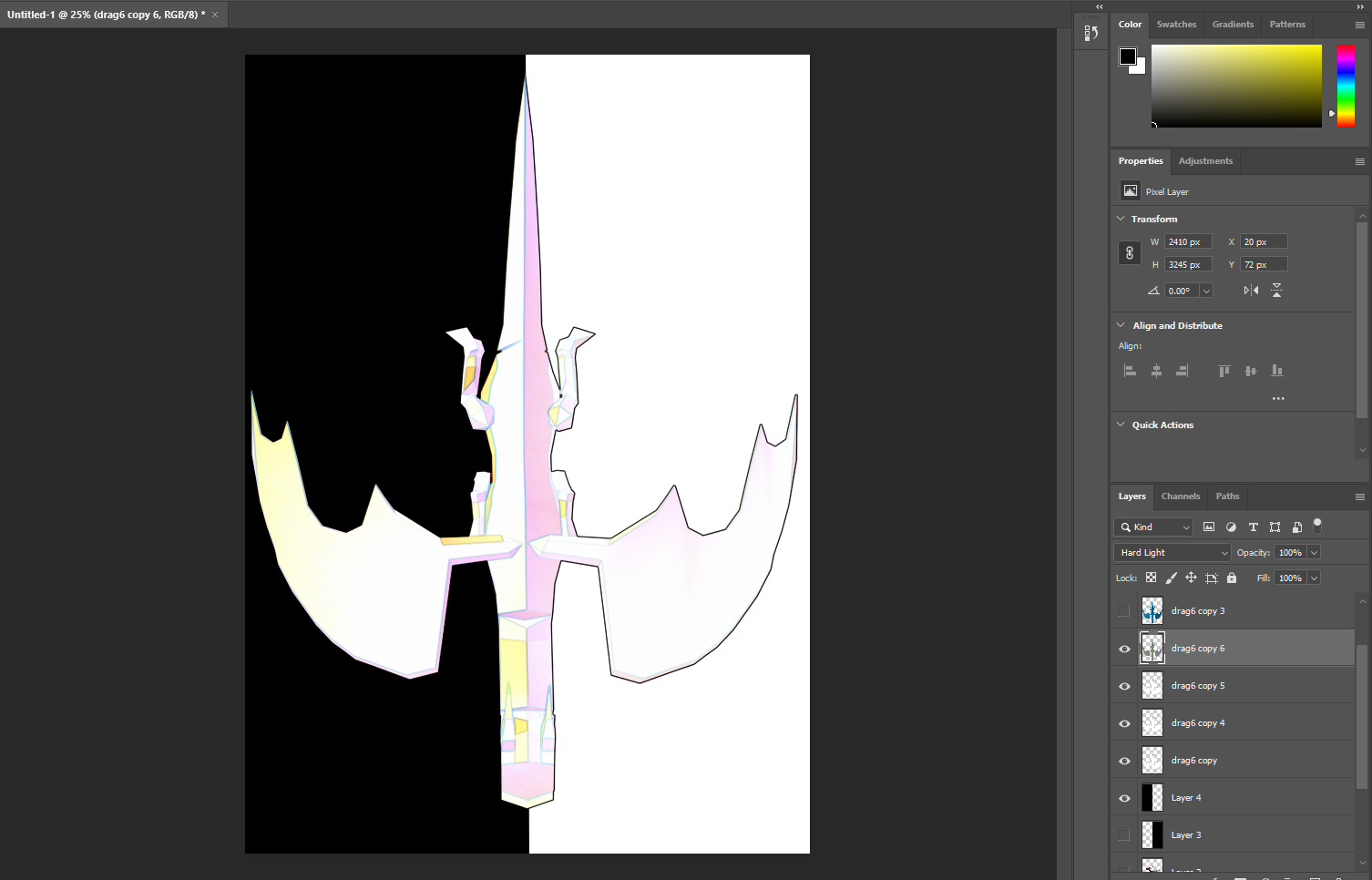
Now I knew this, I headed into Blender and got some renders ready, I done this by opening my dragon animation file and backing up that file, I then created an empty plain axis and making the camera a child of it.
I wanted the camera to rotate around the dragon, so I made it so the camera rotated around the Z axis, linearly for 200 frames.
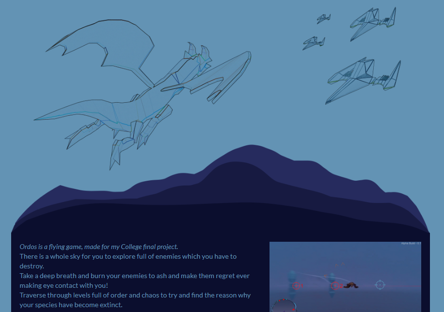
Once I done that I extended all the animations to be 200 frames so they would all be the same length, and for each animation, I rendered one with the gizmos on view and one all properly rendered, here’s a preview of the difference between Gizmos and Rendered.


I then inserted each frame into Sony Vegas Pro 17 and set each frame to be visible for 0.1 of a second each, I then grouped the frames together and shortened it from there so each animation takes 10 seconds.
I done this for all the animations, so I can simply fade between them.
Once I had that all inserted, I began placing my renders and organising them similar to Sketch Plan 1 and 2, since I really like both of these, this is what my Vegas timeline ended up looking like.
And this is what the end looked like, a seamless GIF showcasing my 3D model!
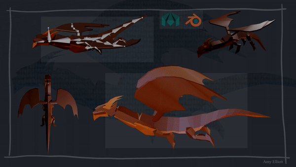
I then thought it looked a little off, and that was because of the boarder in the background, they don’t match up with the straight squares in the middle of the board, so I gave this a straight boarder and I think it looks a little better.
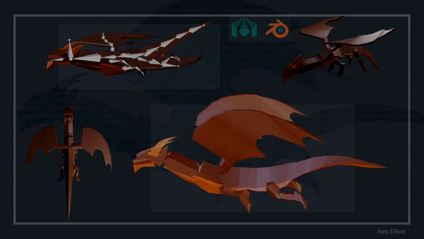
That was my 3D modelling board done! And I’m very happy with how it looks!
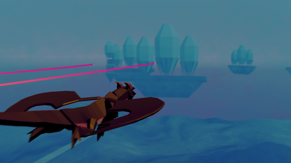
Present (Art) – Screenshot Board
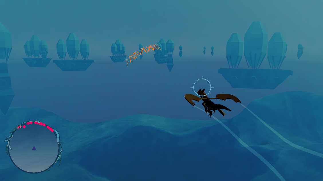
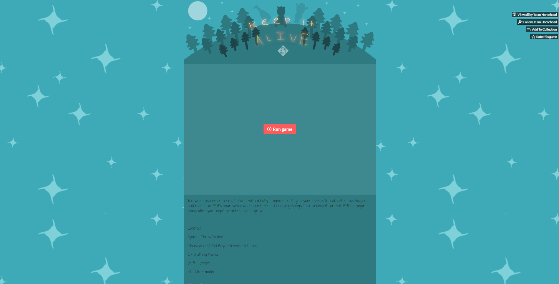
For my screenshot board, I wanted to get a really good screenshot of my game, and perhaps cheat a little and do it inside of Unity where I can adjust the camera myself
I got 3 screenshots which I really liked through taking them in Unity and changing my camera during play mode, these are the screenshots.


I started by opening the last image in photoshop and adjusting its levels so it didn’t look too dark, and I changed the colours slightly so they looked more attractive.
And I thought to add a nice extra touch, I wanted to add boarders around the pictures.


I really love how these look.
Present (Art) – Art Board
For my art board, I want to make it very illustrative, and I also want to make it so I can use it as the banner for my game on my itch.io page as well.
I started by opening a canvas on Photoshop, since my 3D modelling board has an aspect ratio of 16:9 I wanted to make this art board have an aspect ratio of 16:9 as well, so I went with a canvas which was 3840×2160 (Ultra-HD 4K) since I knew my laptop could handle it, and worst case, if it needs to be resized, I wouldn’t be up scaling it so there wouldn’t be as much of a resolution loss.
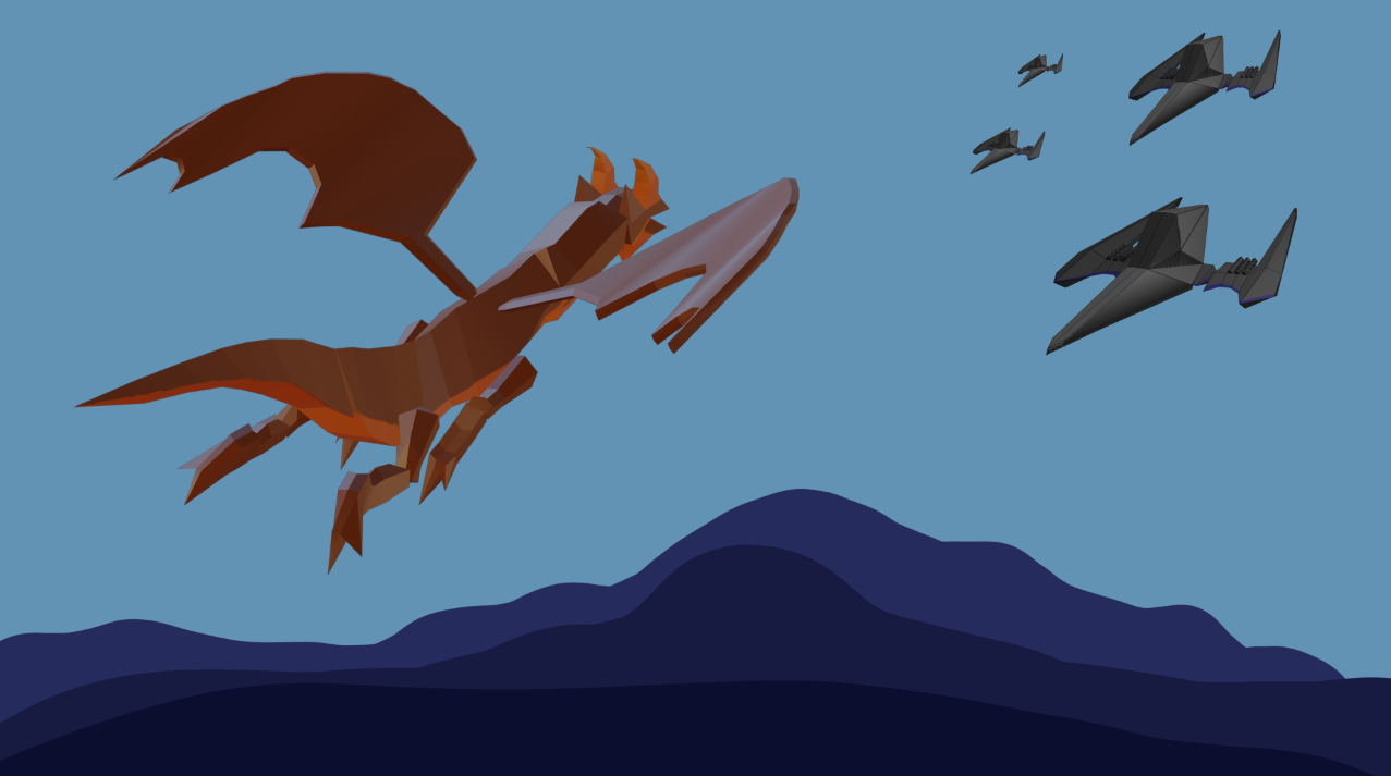
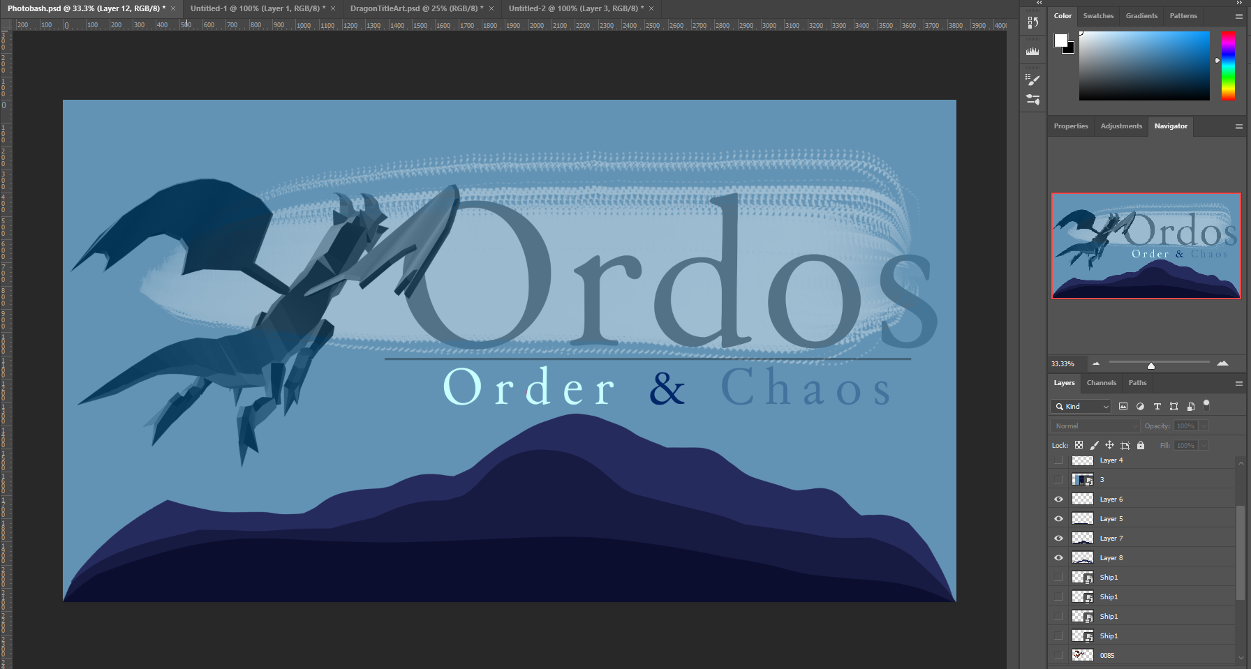
I then done some Photobashing, inspired by this photo which was sent to me.
This is what my photobash ended up looking like:
 From here, I began making this into artwork, I know I also wanted to make this the banner for my Itch page, so I had to stay with the colour scheme which I had set on that page.
I then started off by making the background, very simple as from using those two colours and only adjusting them a little.
I tested this on my itch page to see how well it fit in.
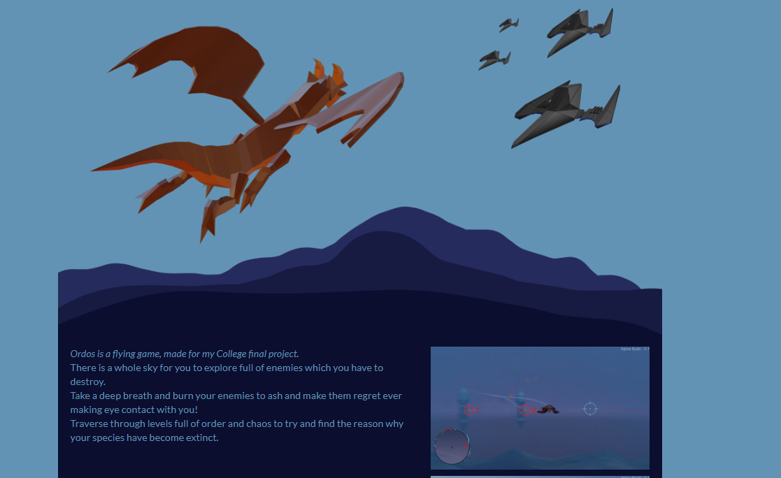
I liked how it looked so far, but I knew I needed to make a few changes to the bottom part and make it so it doesn’t get cut off.
I done these changes and realised that I didn’t really want to paint any art work, so instead I just played around with filters, this is the result
I like how I curved the landscape, I think it looks a lot better that way, but I don’t like how the ships look in the photo, I feel it would look better without them since I also need to fit a title in here as well.
I done just that, I got rid of the ships and inserted the title from my Game Cover Concept art (below) This is what it turned out like and I quite like it.
I then put this on the itch page to see what it would look like, and this is the result
I then decided it would look really nice if I had clouds in the background, so I added that.
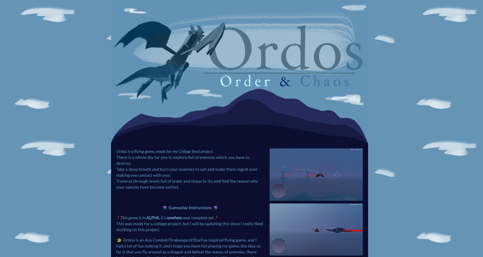
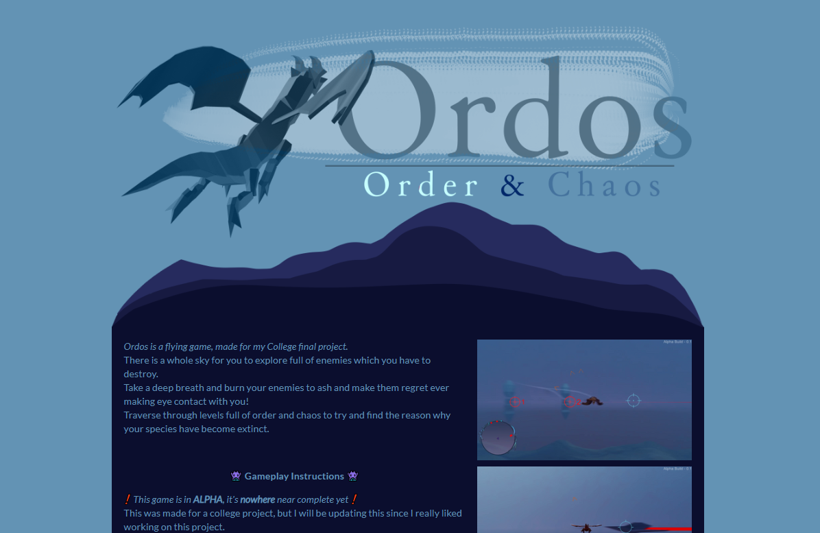
I liked how this looked, so this was my banner for my Itch site, I moved back to the banner and made it so it was presentable on a board.
That was my art board finished, along with my Itch.io banner, and I quite like them!
Present (Art) – Game Cover Concept
I decided for the art of my game, I wanted to make something like box art, so, I decided to sort though all of the games on my shelf and pick out some games with box art which I like, here is the collection of box art.
Whilst doing this, I noticed a lot of them feature a group of characters for the cover, something which I don’t have many of in my game, so I began looking through these box arts for games with little to no characters to get a better idea of what I could do for my final art piece.


These are all the images which I were able to narrow down which had little to no characters in them.
What I’ve noticed from all of these is that the title seems to be the main important thing on these box arts, so I felt I should focus on really nice title art for my game.
I like what was done with Ninety-Nine Nights how half of the image is white and half is black, I feel like that would be something which is really useful to have in my box art since I have to represent order & chaos, and I feel that would be a great way to present it.
I also really like the stylistic simplicity of the Final Fantasy box art, I began messing around with renders on Photoshop to try to photo bash something together which I would like, and this is what I came up with.
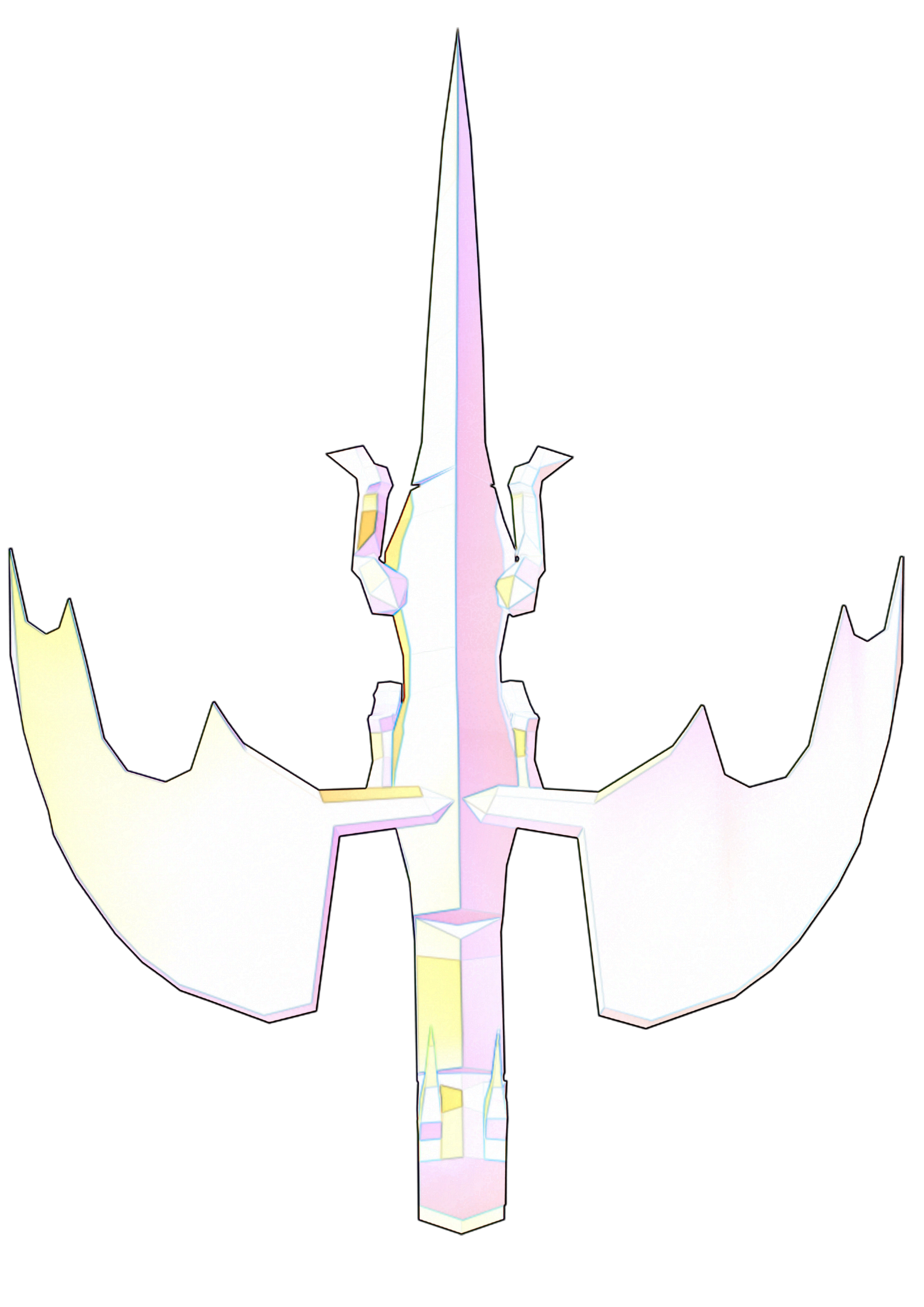
 I made this by getting a rendered image of my dragon at top down, and then inserting it into photoshop.
From there on it was fairly easy, I made half of the image black like in the N3 box art, and then I applied some filters and blend modes to the dragon.
These include:
A layer of this dragon with the find edges filter on it, duplicated 3 times to be stronger, and then another layer of the dragon with high pass on it, and then the layer with high pass on it has a hard light blend mode on it.
And that was it, and I really like it because it reminds me of final fantasy’s art work.
I feel like I could do without the black in the background and just use the image of the dragon in the titleart since I really like the colours in it.
I then took what I had, added a title, and a PS4 banner, and made box art! I was happy with the result.
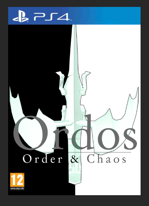
The font I used here is a font which is 100% free for use on Dafont.com, the name of the font is Day Roman.
Itch.io Planning
Week Number & Date: Week 9 (20/04/20)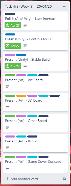
List of Tasks planned for this week:
This week I plan to work mostly on presenting my itch.io page so it looks really nice, since I already have a stable build of the game I can add it straight to the itch page and start making my itch page look nice.
The tasks which are already complete are part of Task 4, the rest are part of Task 5.
I’ve started Task 5 this early so I can get it all done and finished, as well as the evaluation so If I wanted to add more to my game and I’ve finished both Task 5 and 6, I’m able to do so.
Current Position –
What did I do this week and why did I do it? (Screenshots/Videos/Photos)
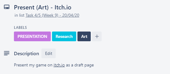
Present (Art) – Itch.io
I started this by looking at this itch page, since it really inspired me, I took a screenshot of the games page and then began annotating it and what I like about it.
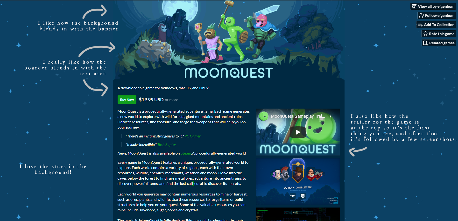
since I was doing this research whilst I was participating in Ludum Dare 46. I presented the game I made with my team in a similar way as Moonquest, so I guess you could call this practice, this was my result:
From my result, comparing it to the Moonquest itch page, I know I could’ve done so much better but the reason why it wasn’t perfect is because it was a gamejam so I had a time limit – So unlike Ludum Dare 46, I won’t have a time limit as strict to present my game on itch.
With this one, I don’t like how big the top of the boarder is, next time I would make it smaller similar to Moonquest’s, I also think it would look a lot better with a lot more colour.
I also don’t like how big the stars are on the background, so that’s defiantly something I would avoid doing when I come to do this for my final project.
Moving back to the itch draft, I began to draft up a description for my game, referencing the layout of Moonquest’s description but adding my own stuff, this is what I came up with.
I really like how I added emojis at the side of each banner in my games description since it adds a lot more character.
For the controls, I simply drew them and labelled them up, but I was inspired from a manual from Drag-on-dragoon which had a controls page which I liked the looks of.
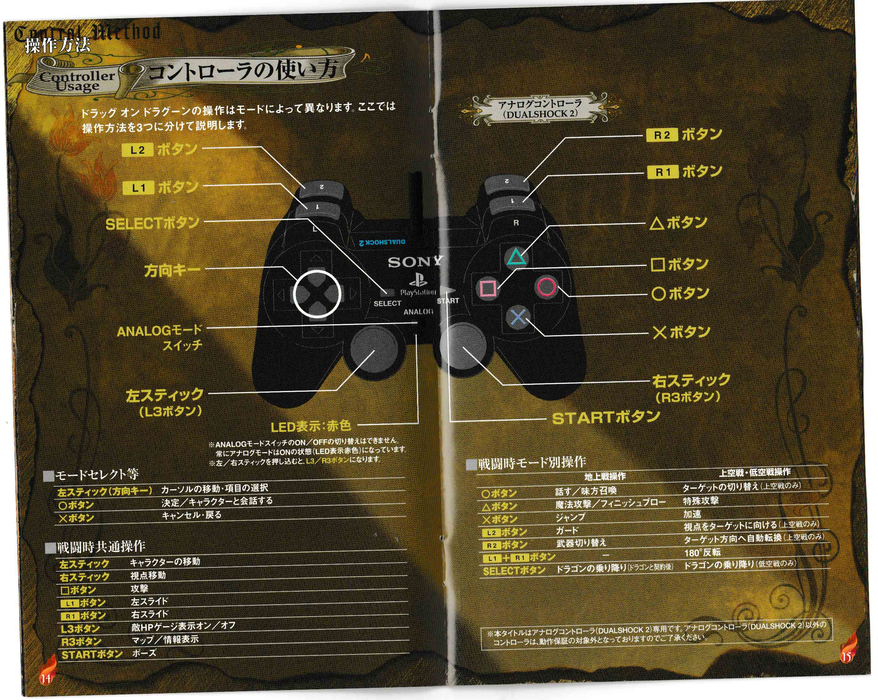
I started with the controls for the controller, getting a picture of a PS3 contoller, since that is the controller which I mostly used to play test the game, so I felt it would be best to have this on one of the controls pictures. Once I had a normal picture of the PS3 controller, I redrew it and coloured it in, since I couldn’t just use that picture taken from the internet, this is the result of drawing and colouring in a PS3 controller, I have also added labels for the buttons in the style of the controls manual above, since I couldn’t read what those labels said on the manual, I added what I thought would be best to show how to control the game.
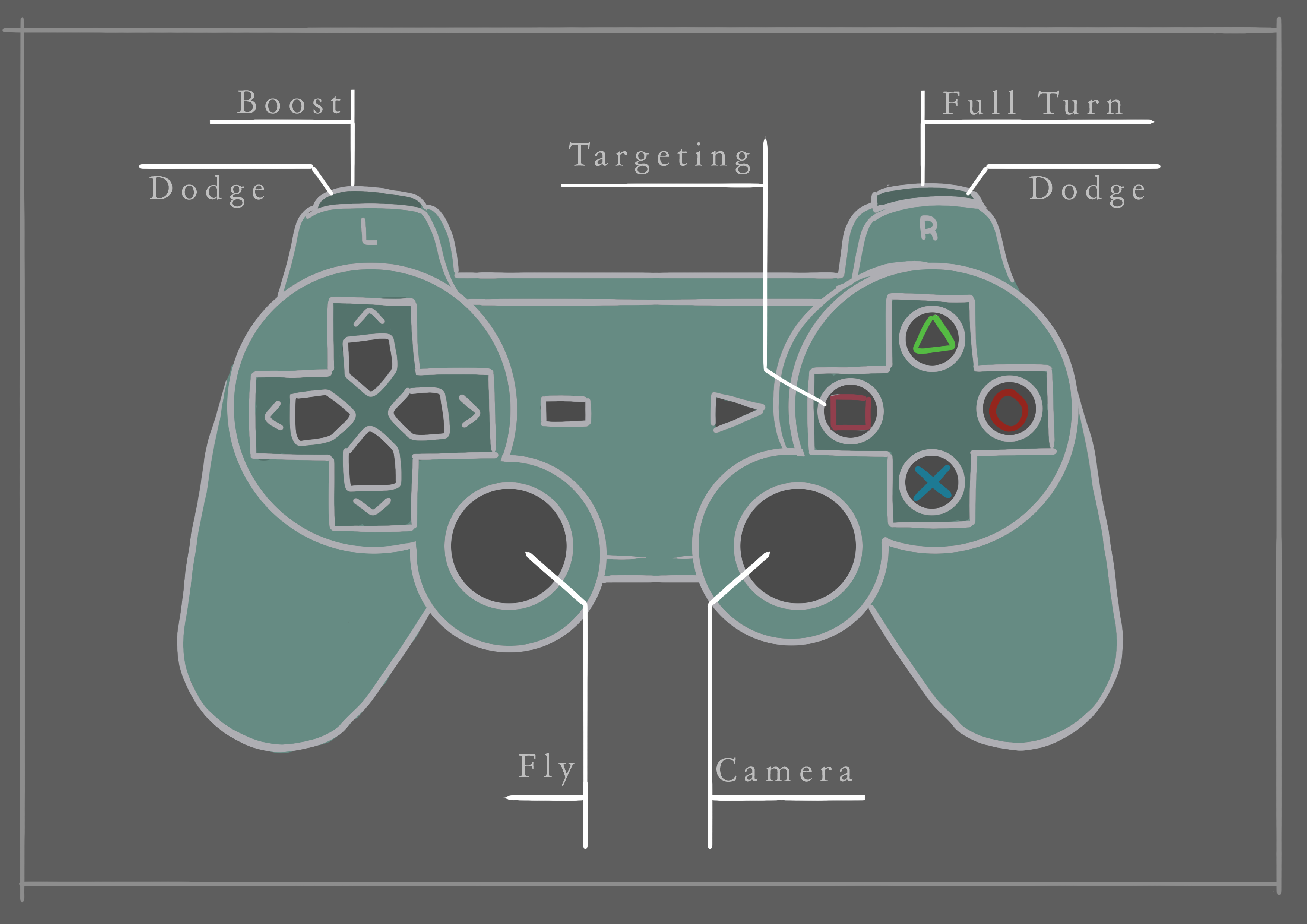
I really like how this has turned out since I can change its colour to whatever I want and it would still look nice, so once I come up with a colour scheme, I could always open up the photoshop file and change the colour of the controller so it fit in with the colour scheme.
One thing I don’t like about this is how blank the background is, so I would probably replace it later on, or add something like an enlarged blurred picture of the controller.
Once I done that I moved onto making the controls sheet for the keyboard, since I knew a lot of players would be playing with a keyboard instead of a controller, I applied the same look as I did with the controller for the labelling, and this is what I came up with
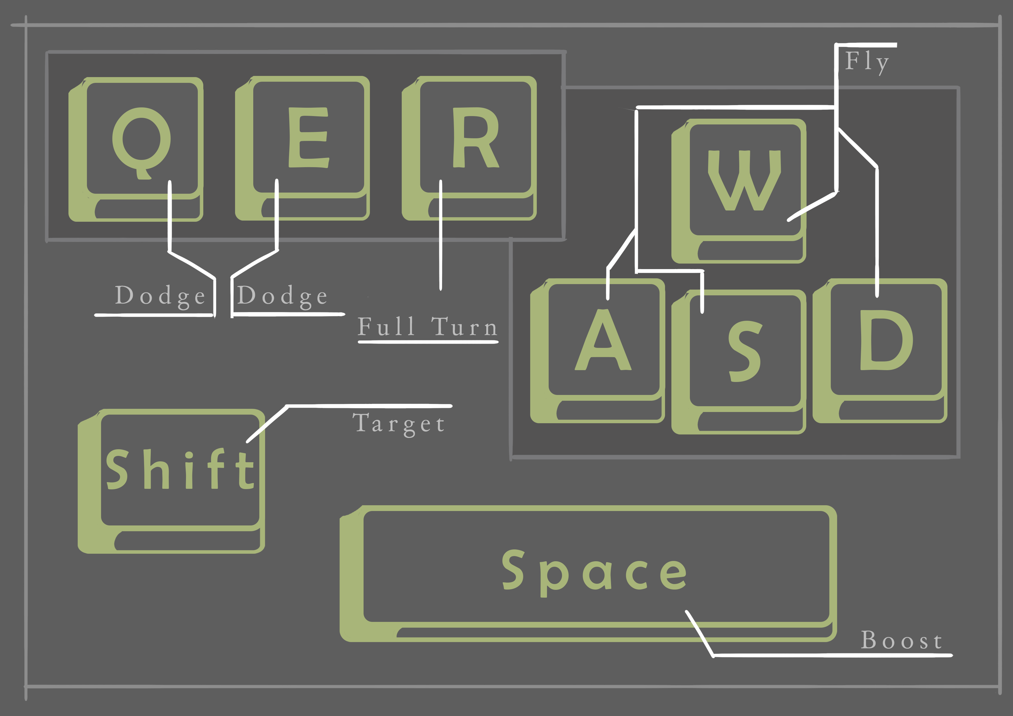
Similar to my controller drawing, the background is very boring, so I probably would change that too later on, and I also can change the colour of the keyboard too to fit in with the colour scheme, but all of this was just made to check out how I’m going to have everything laid out.
Once I got to this point, I contacted Steve Sparkes, since he said on twitter that he is happy to help anyone out with their game project, I met Steve at Develop Brighton 2019 and I thought it would be amazing to get advice from a professional!
I asked him to review my itch page to see what he thought about it and how I would best present my game in his opinion, and he gave me some pointers on how I can present my 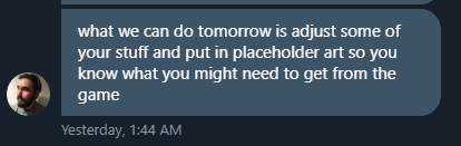 itch page, and I wrote them all down.
The first thing he suggested is put in placeholder art so I can see what the overall result would look like and see if I like it, I really liked this suggestion so I added it to my Trello board.
I also had Steve play-test my game and give me quick last minute changes which I could make to my game, this was putting my FMOD file into my Unity project so whenever the game had to read the FMOD file, it would be in the Unity project instead of reading it from my SSD card, I totally forgot it was there, but I thought that suggestion was good because it would be something that I would forget about when submitting my game.
He also gave me a suggestion with the heart beat in my game, because in the normal FMOD project, the heartbeat was on the same event as the music, which he said wasn’t good, so I made it on a separate event of a heart beat which looped and only activated when the players health is below 40 and referenced that separately on an empty gameobject with a studio listener, this made things a lot cleaner.


He also suggested that the info I had on my itch page was nice, but some of that should go on a separate website, and I agreed with him, I thought that was a good idea, so I added that also to my Trello board.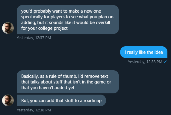
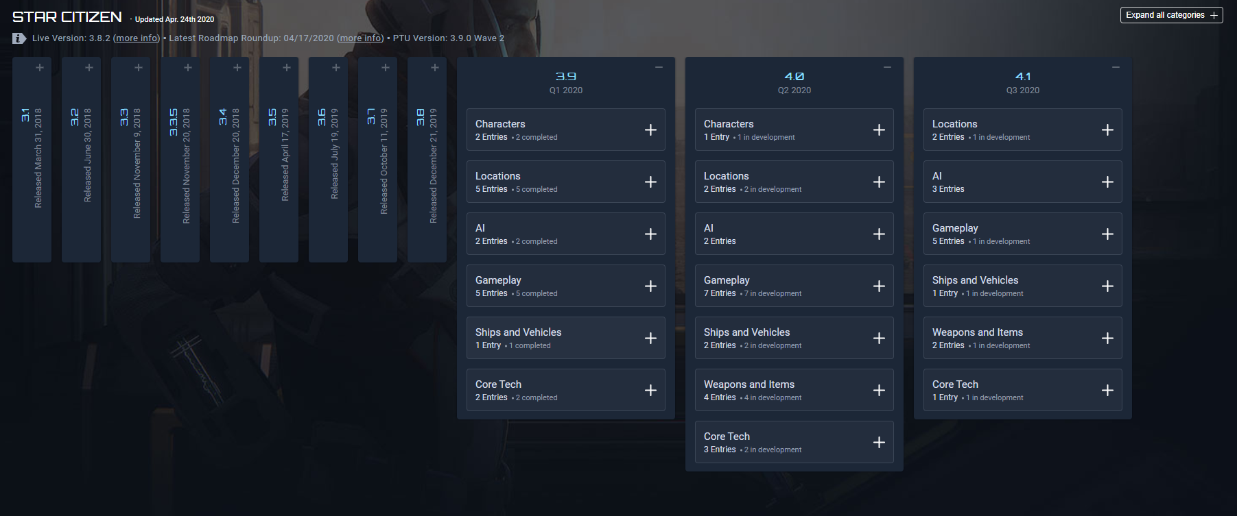
Steve then also showed me this really nice looking roadmap from another game, I really like the look of it, and it looks like my Trello board, except it’s something which the public would be able to see, which gave me the idea to make my own one, so I added that to my trello board.
Moving onto the banner for my Itch Page, Steve suggested that I do a render of the dragon with the ship, or an enemy, and I really liked that idea, I think I want to give it my own twist and do the render but add my own art to it to make it unique, I also added this to my Itch page.
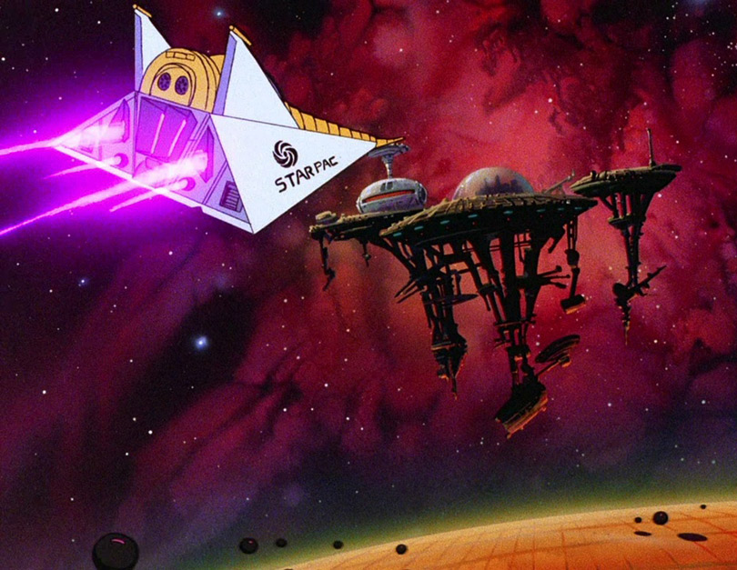
He sent me an image which is what I could get ideas from, this is the image he sent me and I really like how it looks, so I would definitely take inspiration from this piece
I really love how colourful this is as well, but I have to keep the theme in my mind of ‘order’ and ‘chaos’ to perhaps I can do a banner which represents that.
Looking at the Moonquest and Ruya Itch page, they both have trailers on the page to show the game, and I really like how they’re both the first things on the page before the screenshots of the game, so the first thing you see is a trailer, and then the screenshots, the trailer is a video which would most likely make people more interested in playing the game, Steve suggested I have lots of clips which fade together like Ruya’s trailer, but only have it about 30 seconds long or so
I also then asked Steve about his suggestions on Colour Pallets, and he told me that I  should go for a lighter colour scheme.
I agreed with him because if I were to go for a colour scheme from my game it would end up being too dark, so I worked out that it would be best to make a colour scheme before I work on making art work for my itch page, so that went on my Trello board too.
This is what my Trello board ended up looking like after getting advice from Steve.
Talking to him really helped me plan out how I want to present my game in the best way and I’m so glad that I did get his opinion.
Placeholder Itch Planning
Placeholder Screenshots
This task was simple, I took a video of my gameplay and then used VLC to skip through frames and take screenshots from the video, these are the screenshots I managed to get.


From here, I uploaded them to my Itch page, and narrowed down the pictures to 5 once I had them uploaded by going through each one and getting rid of ones which look similar or boring.
I ended up with these 5:
- What went well with this task?
I was able to quickly put together some screenshots which I could use as placeholders, these help me when building this itch page with the layout of how I’m going to have everything so I can adjust things and replace these placeholder images without losing a style I could be going for
- What didn’t go so well with this task?
These images are not amazing or final, they’re just placeholders, some of them could be used in the final product, but it’s highly unlikely.
Colour Scheme
I started off with the colour scheme, since I felt that was something very important that I needed to have before I do anything else, so when I put my page together, nothing looks out of place and it all goes together because of the colours.
I started this off by using this Palette Generator webpage which allows me to input an image and the page makes a palette for you based off of the image you put in, this is the result I got for a screenshot of my game.
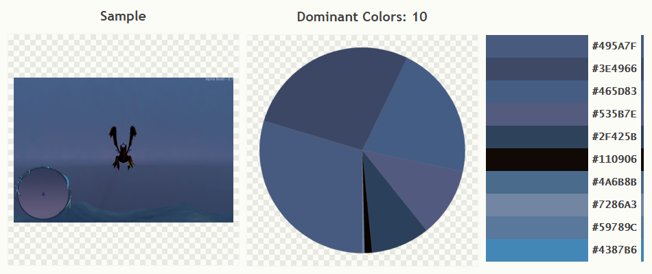
I didn’t exactly want to use this exact colour scheme, but I took inspiration from this, this colour palette made it apparent that my dominant colours are more cool purples and blues, so I searched up some really nice blue and purple colour palette ideas using a colour palette website. I found a few which I really liked and put them down in a list to narrow them down.
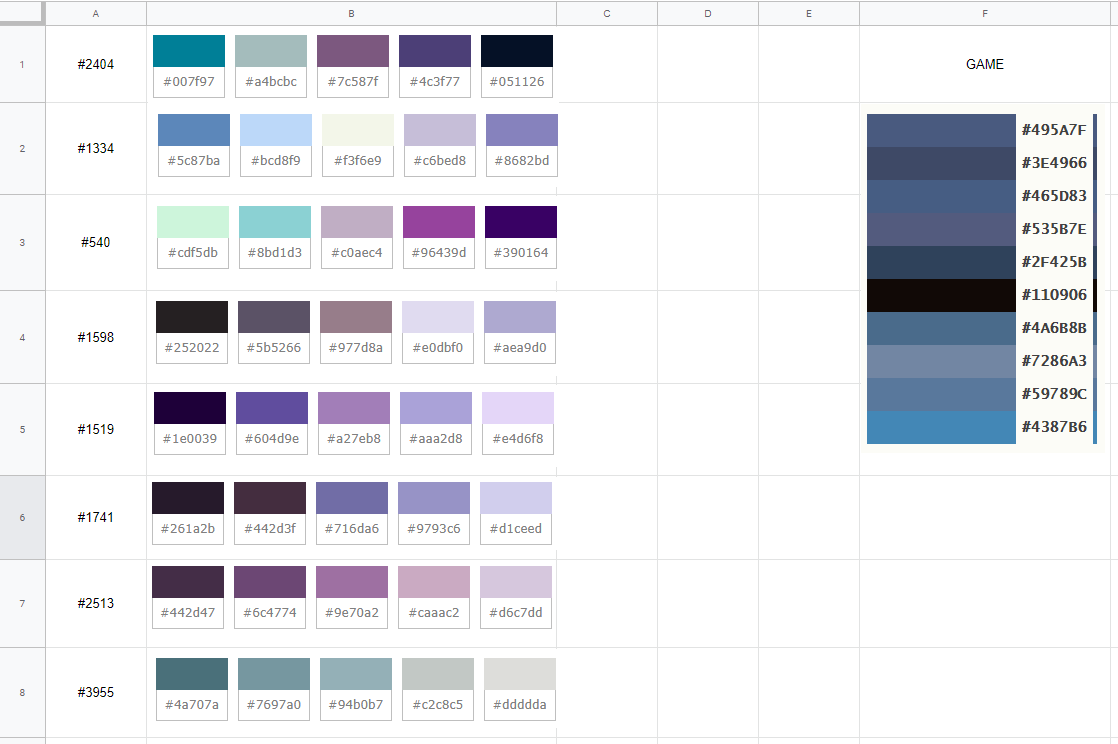
Then, to help me pick, messaged a few people to ask them what colour scheme they liked the best, the first reply I got back was 3, #540, so I tried that one on my site first, I tried a few colour combinations of this palette on the page.


I didn’t really like how any of these turned out, since they didn’t look like the games colour palette at all, I moved onto another colour palette.
The next one I tried was the 2nd one, #1334, it seemed a lot cooler, and less bright then #3, below are the results:


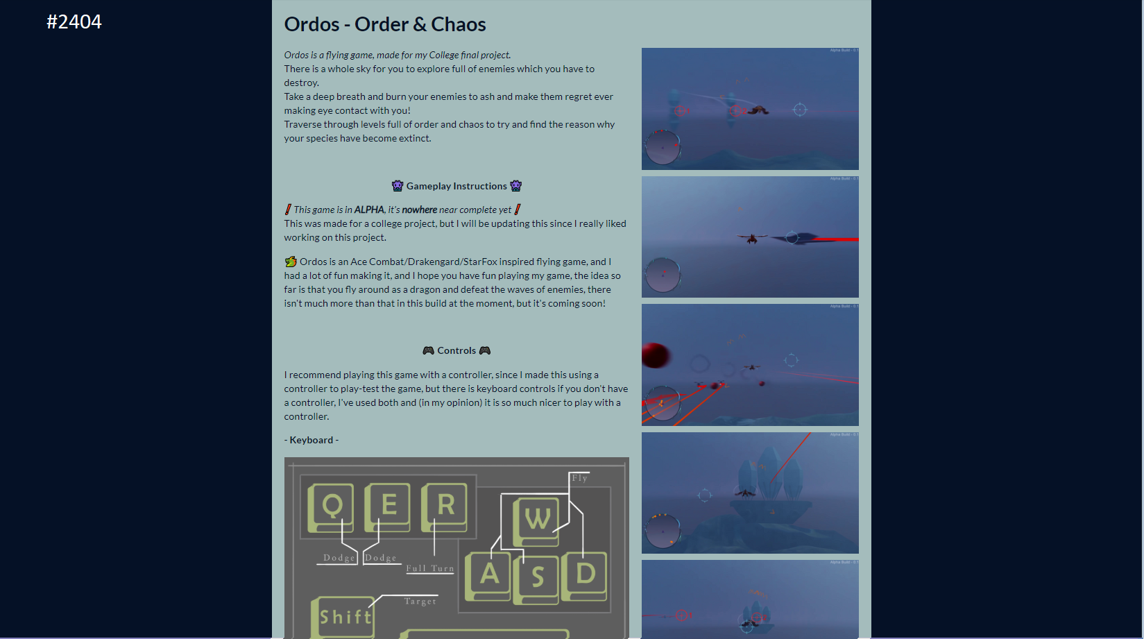
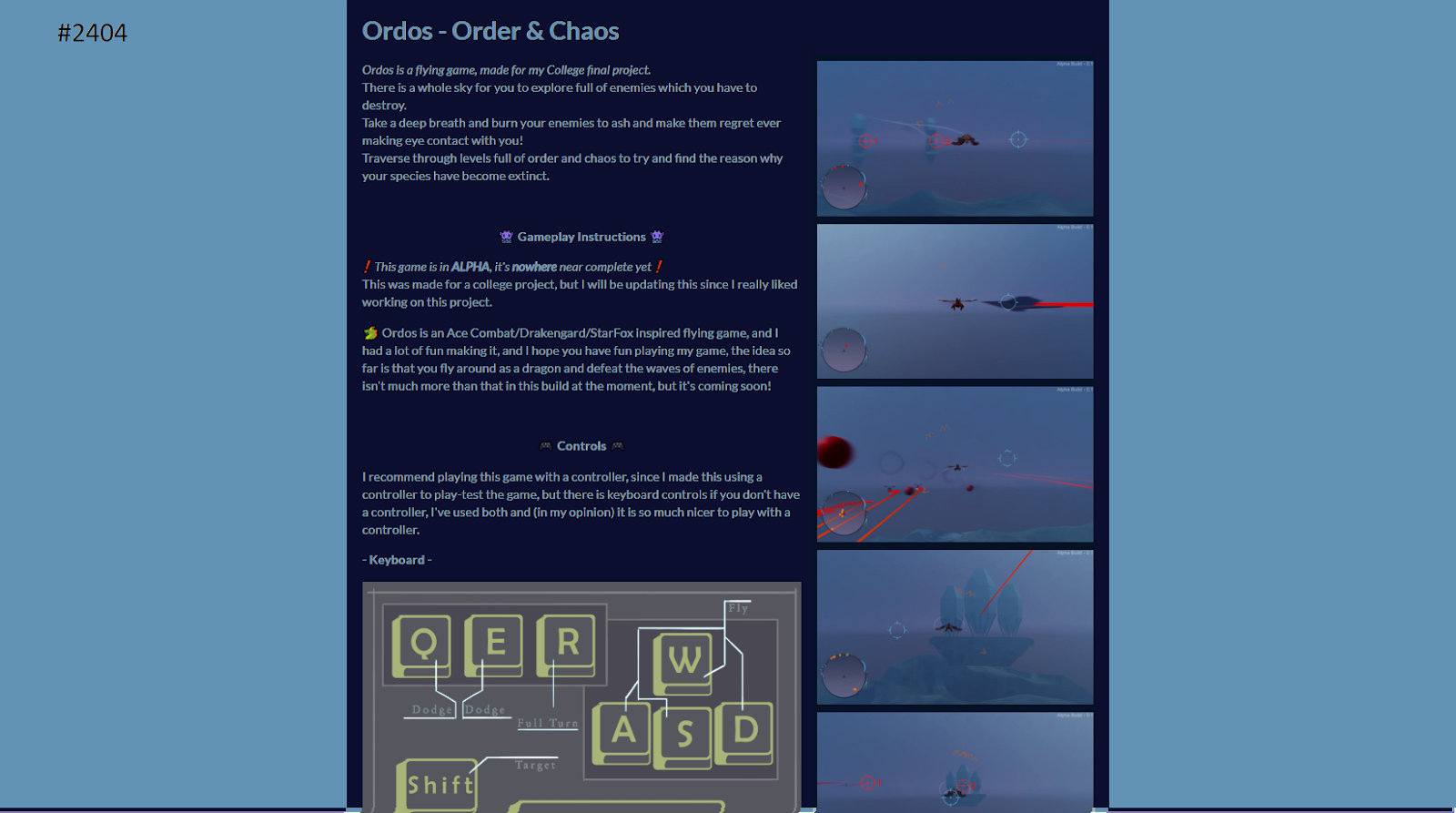
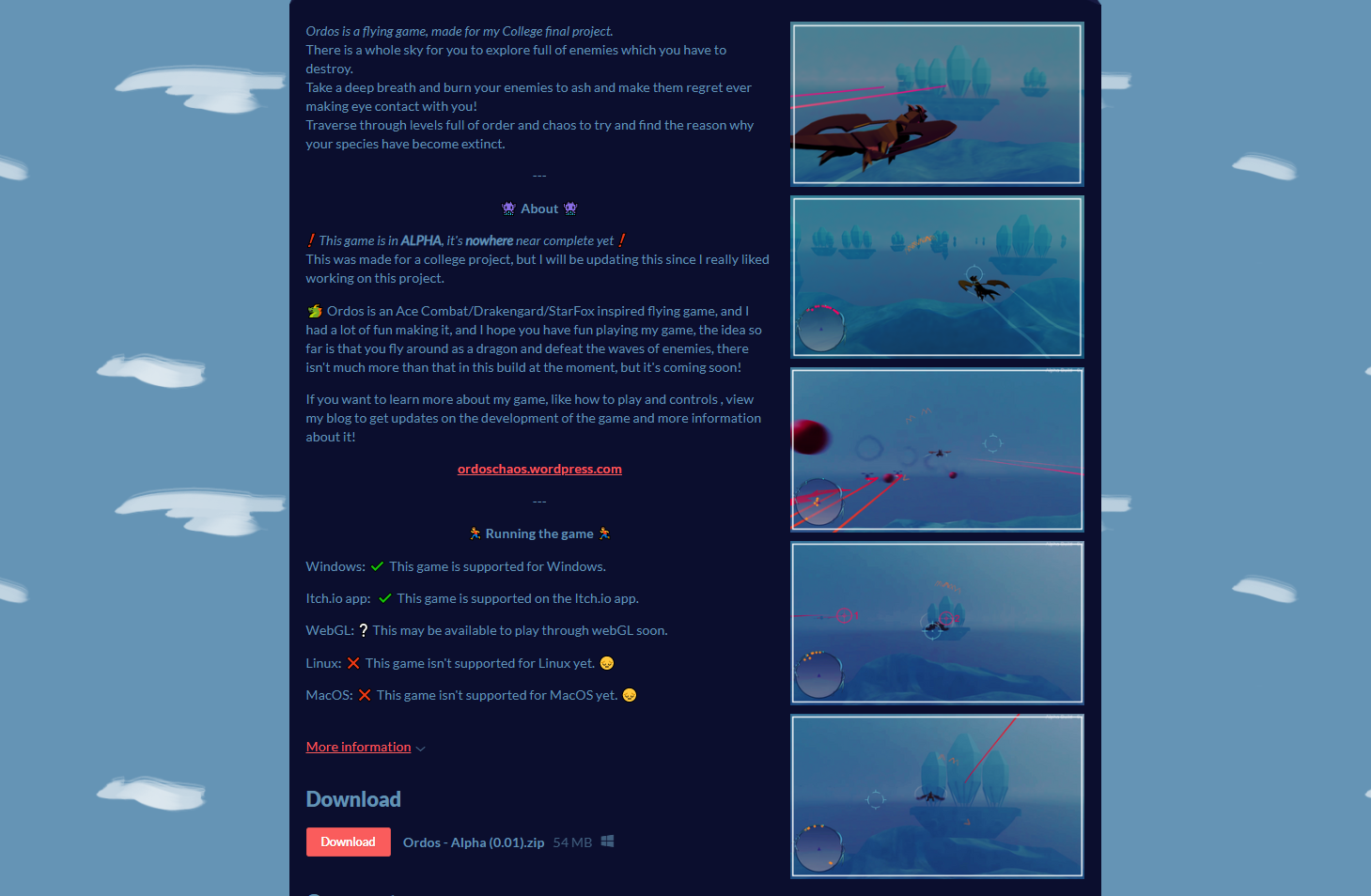
I then moved onto the first colour palette on my sheet, which was colour palette #2404, which was a lot darker than the other two, these were the results:


Then I moved onto the 4th colour palette which was #1598, a much more neutral palette, these are the results:


I next tried my 5th palette #1519, but I ended up not liking this one at all, the colours were far too purple and didn’t fit in with my games screenshots at all, looking at the rest of the palettes, they wouldn’t fit to well in either, so I decided to get a little creative.
Out of all of these palettes, I decided to pick the ones which I liked the most and bring them into Photoshop, I narrowed it down to these:

I took these images and then messed around with the hue and saturation until I came up with something that I like, this is the results:


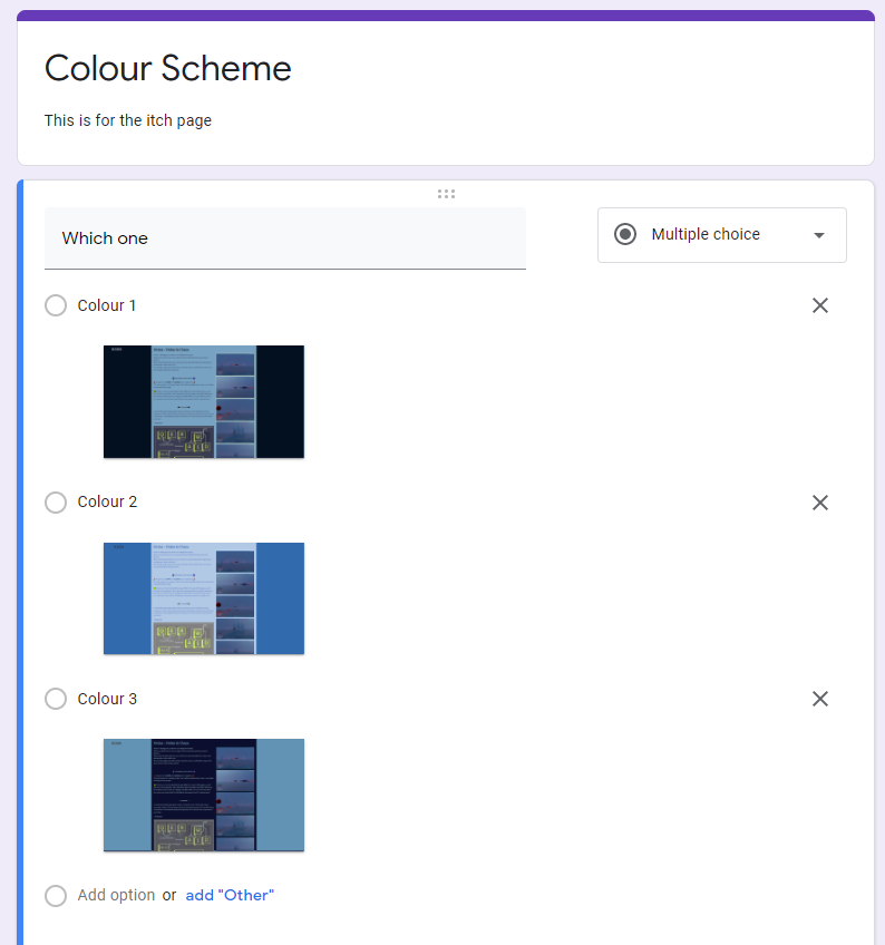
I made a survey and asked a few friends to fill it out to get the results which I need.
I was personally hoping that the first colour scheme would win, but I don’t mind if any of the others win since I could make them work anyway.
I left this for a few days to gather responses.
What did I find difficult or easy?
I found it difficult to find good colours to use for my itch page, but I simply think this is because I didn’t have any art work on there yet which was polished, so I can make it work when I have the right palette
Week Number & Date: Week 10 (27/04/2020)
List of Tasks planned for this week:
Mostly this week, I want to put my boards ahead of my itch.io page, so I can get them all done and complete and submitted and move straight onto my evalutation.
I don’t want to put my Itch page ahead of any of my work since it isn’t compulsory.
Current Position –
What did I do this week and why did I do it? (Screenshots/Videos/Photos)
This week, I done the 3D board at the top of this page, which turned out like this, all the details on the process of how I made it are above.
I have also made a start to the art board which would also feature as the banner of my Itch.io page, whilst doing this I checked on the colour scheme form which I published and got the colour scheme which I would be using for the itch page and this art board.
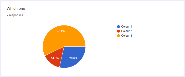
This was the chosen colour scheme, so I made a colour palette out of this to use on my art board.
There was only 2 colours used for this, but I would be adding more.
I added the banner and the background to my itch page, I also added my screenshots of the game.
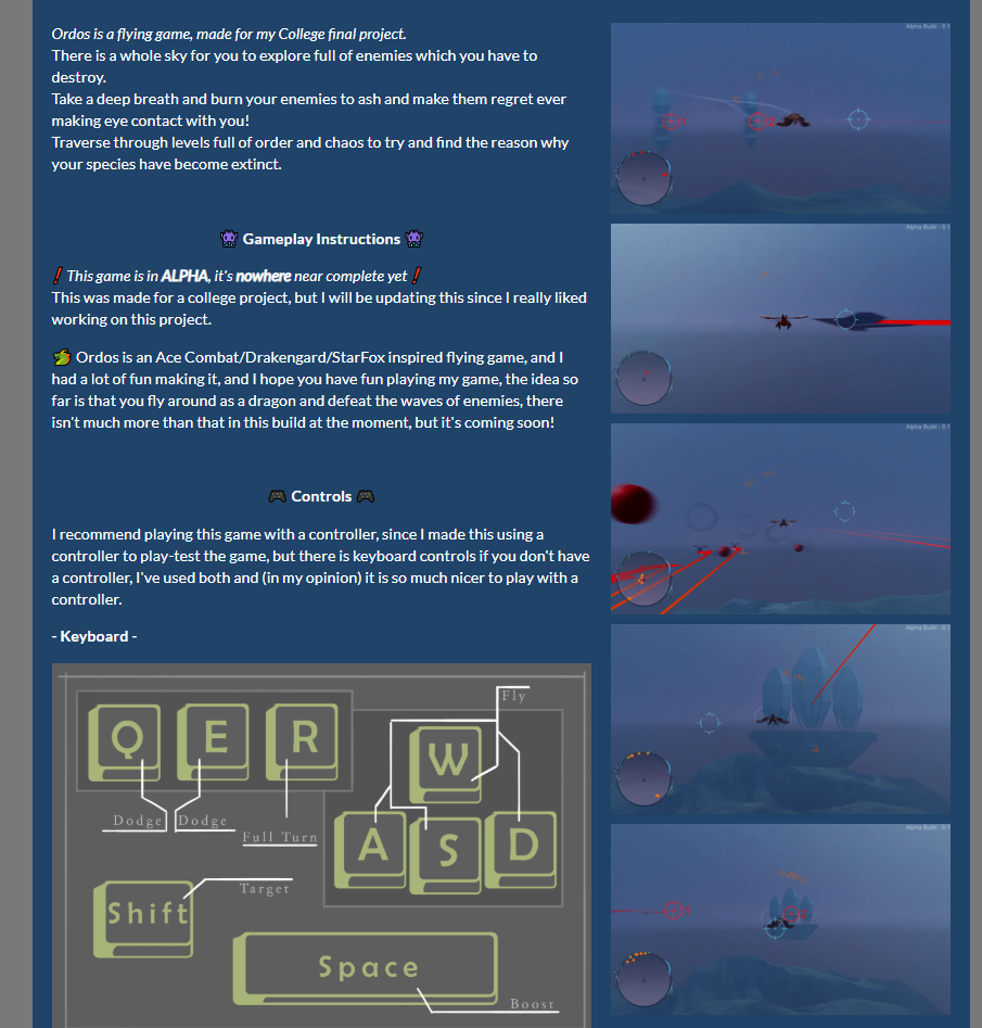
Like Steve suggested, I should make the itch description shorter and make a wordpress blog to add all the extra information, so that’s what I did, this is the wordpress page.
It’s very simple, but it has all of the extra description information on there so people can view it on there to keep the itch.io page small and neat.
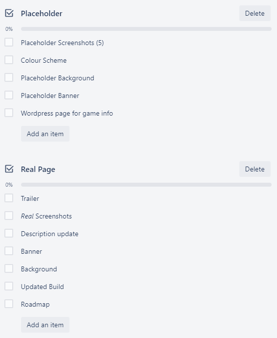
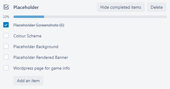
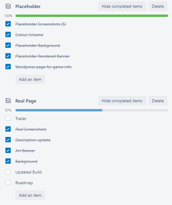
I have now completed all of these tasks on my trello checklist.
What did I find difficult or easy?
