Exhibition
For the exhibition, we need to present our final project, so I have done some research on how I can present my work, I done this research by taking my own pictures of some student work presented on the college walls for their Exhibition.
Student Work / Primary Research –
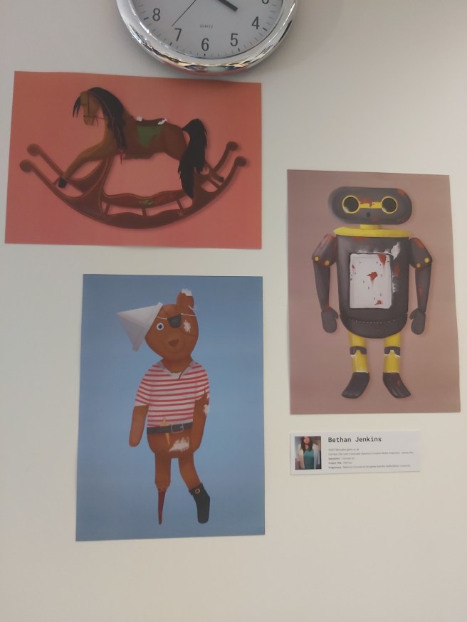
I like how there is two images which are portrait and one which is landscape, it really showcases the work nicely instead of them being in a straight line, one after the other, which draws your attention to all three images instead of just one at a time, I also like how the work has a consistent look to it, with the background all being of the same tone of colour, a desaturated light colour, I also like how the artwork is in the same style, instead of many different styles, this includes the colours and the shading.
I don’t like how bright the coral is on the top picture, I think that one is a bit too bright in comparison to the other two photos. I feel like this exhibition could’ve looked better with small cut-outs on the outside of this, in the same style.
I like how there isn’t any titles or boarders on the images, it makes it stand out from the other boards because of this, I feel like having titles and boarders would look strange on this piece of work, since it is supposed to be more traditional, and having no boarders honors this.
This would help me with my planning because I now know that I want to keep all of my work looking consistent with the art style which I have gone with for my game.
It also helps me because if I were to have any traditional art on my boards, I wouldn’t have boarders on them to make them look more traditional, and make them stand out a bit more.
I would pay close attention to all of my boards coloured backgrounds to make sure that they all match up if they’re different colours, I would need to make sure they’re all at the same saturation, and one picture isn’t brighter than the other.
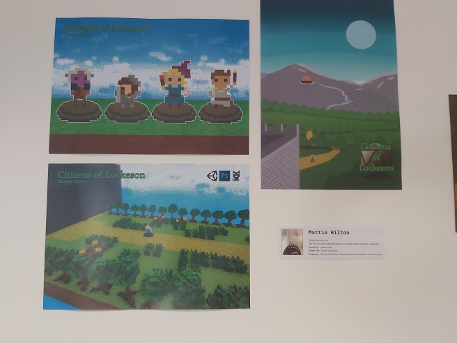
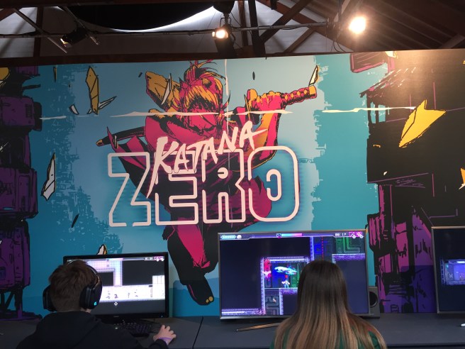
I like how this is laid out because there is a few different areas covered in these three pieces, there’s 3D modelling in the top left, showing off the player characters with a title of the game, this is good because in the game you don’t get that good of a view of the character since the camera is further away, and then on the right, we have some artwork, which must’ve been concept art for the game, which shows us what the creator thought his game looks like, and to promote his game, he also has an in-game image on the bottom left, this one shows the title, what programs were used and a screenshot of the game, this is useful so the players know what the game looks like before they begin playing it.
I don’t like how inconsistent these boards are, the concept art image has a different logo from the other two, and I don’t like the colour of the logo as well, since it blends in with the other colours in the images which draws your attention away from the logos, those logos really need something like a border or a banner on them so they can clearly stand out and not blend into the images.
This stands out because of the bright saturated colours of the grass and the sky, this really draws your attention to the boards (and the game on display at the time) which is something that you need at an exhibition to get more people to try out your game, which in turn can mean they’re interested and want to keep following the development, which is what you want because if you have lots of people interested, that means you have a better chance of catching the eye of some important person which could offer you a good position.
This would help with my planning because I’m making a game as well, so seeing this I could try having one board of 3D models, one board of concept, or promotional art and then finally a screenshot of gameplay, this board has taught me to spread my work out by profession, to show the broad range of work I’ve achieved.
From seeing this board, I would try to avoid using different looking titles on my boards, I would either make sure they’re all either the same or there is no titles, I would also make sure, if I do have a title, it isn’t in a colour which would blend in and be unnoticable, since titles are meant to be noticed!
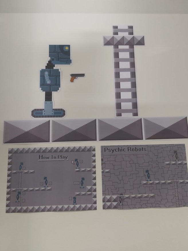
I like how this is laid out with the cut-outs at the top and the two landscape images below it, I also like how the floor tiles are there like a separator between the cut outs and the landscape images.
I also like how the cut out images are laid out like it’s a part of the game on the wall, this reminds me of Mario Odyssey where you can warp into the walls to complete a puzzle.
I don’t like this piece of work because of the limited colour pallet, it feels very empty and lacking and the images don’t really do the game justice, I felt more colour should’ve been added overall since the robot and gun look out of place from everything on there because they have a different, more vibrant colour in comparison to the grey on all of the other things.
This stands out mostly because of the cutouts of the robot, gun and ladder, like I said above, they stand out because they look like the actual game stuck on the wall.
This is beneficial because we want to give people something to look at if there is a crowd in front of your game, and if the player has something like that on the wall demonstrating what the game looks like, it could draw their attention and make them want to play, I think it stands out because of its unique shape in comparison to the landscape rectangles which the other exhibition boards are on.
This image has inspired me to try cut out renders for my final exhibition which I can have placed on the walls, looking at exhibition pieces with cut outs look a lot more appealing to those which don’t in my personal opinion.
From seeing this exhibition piece, I would try and avoid using a boring colour scheme, since I feel like it really buries your work and makes it easy to miss if the other pieces around the room are bright, colourful and saturated, I want to make my work as eye-catching as possible and using desaturated colours is the first thing I think I should personally avoid.
Other Photos – These are the rest of the photos which I have taken for this section of the research
Rezzed photos / Primary Research –
These photos were taken at a games convention (Rezzed, 2019)
Which better helps me if I ever have to advertise my game myself at a games convention in the public eye
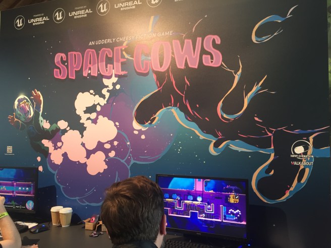
I like this because it is fitting a colour scheme of darker tones, like purples and blues, and from what I can see on the screens, the game does that as well.
I like how the banner is illustrated to really draw the attention of people to come and play the game, with the title being large and a colour which you can see which doesn’t blend into the background.
Titles are a good way to tell a player what the game is about and having it big and bold and visible is a good idea so people get to know quickly what it is.
I like how the computers are spread far enough out from each other so that the main illustration can be seen properly behind it and nothing is hidden by a computer screen, having a display this big is good because it gives people something to look at whilst they wait for their turn to play the game.
I don’t like how the small logos are just dotted around on the big display, they feel really out of place, and they remind me of programs pinned to a computers home screen, I feel like these should’ve been bigger and more emphasised with boarders around them which blend in with the illustration and feel like they belong there.
I also don’t like how the unreal engine logo is plastered along the top of the border, in my opinion, this really doesn’t look nice and there only has to be one of these, they should also blend in with the illustration to feel more natural.
I don’t like how the buisness cards are laid out, they’re in a small cardboard box which doesn’t look professional, I feel like these buisness cards would’ve looked nicer if they were spread out on the table in the middle of the two computers so they’re easier to grab instead of having to lean over the people playing the game to get one.
I also feel like the computers are lacking decoration and they should have something stuck to it which is advertising the game, like a cut out of a character.
I think the illustration stands out the most to me here because of how big and colourful it is, it isn’t stupidly saturated and colourful but it sticks to a satisfying colour scheme and matches the games colour scheme itself, this stands out because of how nice a matching colour scheme looks in comparison to a stand which hasn’t got one and is all over the place, this is beneficial because you really need to catch someones attention with the colours.
Another thing which stands out is the Unreal Engine logos plastered at the top, these stand out because they’re repeated and easy to see if you’re in a big crowd of people since they’re at the top, this stands out because Unreal Engine is a free game development software which many visitors from Rezzed would’ve used if they’re aspiring game developers, seeing this may draw them to the stand and get them to watch and play the game to see what they could potentially make in Unreal Engine, this is beneficial to inspire game developers who are just starting with your game, and with that you could get some fans which follow you just so they could understand a little bit more about your game on the game development side of things, which is a win-win situation if you get fans!
This would help me with planning because I want an image which is big and would draw peoples attention, and I really think a carefully drawn illustration for the game would do the job, since I feel like illustrations for games are good because you get to see how the developer of the game envisions it.
If I’m having business cards on display for my exhibition, I would have them spread out on the table, because I don’t like how they’re in a small cardboard box for this display.
I would also make sure I have some cut outs to stick on the computer, since this would make the computer which the game is on look so much nicer, instead of a boring monitor
I like this work because of the bright attractive colours on the banner. These colours all go really nicely together since they’re bright and saturated and I really like the art style on this work as well as it looks like a sketch, and like it has come out of a comic book, and the bright glowing logo of the game just gives it more of a cyberpunk feel, which I really enjoy, seeing the game being played on the monitors below it, you can see how the game keeps that same bright cyberpunk feel, so I’m very happy that the art style is kept consistent, so you know from seeing the art and this game that they’re linked.
I love how the art work is laid out on the big poster because the character is in the middle of the screen, with the two monitors on both side of them, and unlike the last Rezzed photo, there isn’t any random pictures or QR codes floating around on the board.
I don’t like how I can’t see any business cards, or anything about the game or the studio, so from seeing it just now, I wouldn’t know who made this and who to reach out to if I ended out liking this game, and the big thing is, if the game was still in development and an actual build of the game wasn’t released yet, there is nothing for the player to follow so down the line they may forget about this game.
I also don’t like how boring the game monitors look, I feel like there should be cut-outs stuck to the computers, or contact information or a business card.
The only thing which really stands out for me here is the bright illustration on the board, this stands out because of the unique art style, and bright comic-looking colours, along with the glowing title, the illustration is really well done and looks really nice, this is beneficial to draw someones attention to this game from the colours and art style
It would help me because I know I need to have some sort of illustration to attract people to my product, something which would catch the interest of many people, and I feel like an illustration similar to this would do the job.
I would avoid doing something as plain as this person has done for the display, I feel like so much more could’ve been added to this but all there is is a big image and 2 monitors, it feels very lacking and that’s something I want to avoid when it comes to my exhibition.
Seondary Photos –
These are photos which I have collected from the internet which people have taken from conventions and just concept pieces presented in general
I also like how there is lots of different colours on the character drawings, which make these pieces pop, and I also like how this lady has her work presented in portfolios on the table so people walking by can look through the books at more of her work.
I don’t like how there is some pictures with white backgrounds and some with coloured backgrounds and some with bright backgrounds, I guess in a way this makes the viewer know that this artist can draw in different styles with and without backgrounds, but I feel like it really off-sets the work and makes more of the pieces stick out than the others
I like how this artist has her artwork presented in 3 different portfolios on the table, this allows the viewer to flick through her work to get a better idea of her skills and to see a wider range of her work rather than the work which is just on display.
I also like her use of black fabric on the table and on the stands to make sure some of her stuff stuck to a colour scheme in the background of her photos, this is also because she has white photographs, so they stand out more against the black background, this is beneficial to this artist because you want to actually see the art work, and if it blends in with the background (Similar to the title on the work 2 boards above) No one would see it as easily and would have to take the time to squint to see this, which you don’t want them to be doing.
I feel like the presentation of this would help me with my final piece as from this, I could have something on the desk which the viewer can look at if they don’t want to play my game, it’s also good to have something for someone to look through if the game is already occupied with someone playing.
Looking at this work, I would personally try to avoid lots of blank white space on my presentations, this makes the work look unfinished and not as eye catching, I would also try to not have white on my presentation whatsoever, if possible.
I would also use gradients in the backgrounds of my pictures.

I really like how these people have used 3 TVs to present their game, the top 2 being a trailer of the game playing at different angles so people can watch that whilst waiting in a big crowd of people, which would draw that closer to that stand.
In the blog post which this picture on, it was detailed how important it was to have the nintendo switch signs up, which show people this was a nintendo switch game with a switch hands-on demo in 2017 (the year of release of the switch), and they had switches there which you could play the game on, so most of the people came to the stand to have a go on a switch for the first time, and in turn they played the game and ended up really liking it, so it was a win-win situation for them.
There is nothing which I really don’t like about this since I feel like they presented everything really nicely.
The one thing which I don’t like is on the blog post they listed the price of everything and the total, and this set up was very expensive, something which I can’t afford, and something which I can’t replicate at the exhibition at college since I can only have 1 computer screen and 3 pictures presenting my game.
I really like the fact that they stuck with a consistent colour pallet which makes this stand look really nice, I like the black and purple theme of this and I really like how it’s stuck with on everything on the stand, this sticks out because some art stands don’t have a colour pallet, since their art work would all be random, so the benefit of having a game stand and only dealing with a few amount of boards is that I can stick to a consistent colour scheme and make my work stick out more than a exhibition with multiple boards and lots of random colours.
I feel like this would help me because I like how the stand has flyers and a cut out of the title hanging in the middle of the 3 tv’s.
I want to try to make flyers for my final presentation now to advertise my game, where it is published and my portfolio.
Seeing this stand, I would try to avoid having the same picture twice, like they’ve done here with the roll down banner and the long sheet, they could’ve done so much more to catch other peoples attention if they put some other art piece up instead of repeating this, this would affect me because I was thinking of presenting my game in a PS4 box and an Xbox One box, so I want to make 2 different pieces of art work for these.
I also love how this diorama is surrounded by tv screens where you could play the game, this would draw players in similar to the previous exhibition where, even if there was a large crowd, the people queuing up can look at the 3D model whilst they wait, so they don’t get bored and leave without playing.
There is nothing here which I don’t like, but one thing I think they could’ve improved on is they could’ve had some tv screens above the model with a trailer and gameplay of the game playing, since the 3D model is very interesting, but not interesting enough to wait around for a very long time.
This stands out because of how close the model is to the actual game, it really makes you appreciate the game a lot more because of the detail, this is similar to when life-sized models get made for upcoming games, with all the realistic detail in them, this stands out because it’s a different (more expensive) way to showcase and advertise your game, it really does catch your eye though and immerses you within a life-sized version of this world which you can play on console. It’s beneficial to keep people entertained with other stuff whilst they wait to have a go on your game
Since I’m planning to have a 3D model of my dragon on display for my exhibition, I’ll be using this to help me, although it wouldn’t be to this scale! This makes me understand that I need something different on my exhibition display to really catch peoples eye, I want to make it so my exhibition sticks out like a sore thumb and I think a printed 3D model would really help me with achieving this.
There is nothing here which I would avoid doing, but of course I can’t do my work to this scale since I only have a small area to work with, I would love to have some sort of art work to immerse the player into the games environment.
Presentation
This is going to be ideas of how I can present my boards to make them look the most appealing that I can with the limitations I have to fit.
I know I would only have the limit of 3 or so boards, so I want to show as much as I can on these, that means one board could be for concept art, one board could be for 3D modelling and one board could be some promotional art, or render or screenshot of the game.
I have so many things which I want to have shown off for my exhibition, for example, I want to have a laminated sheet of the controls for the game, so the player can understand how to play easier, or read that before they start.
I also want to have flyers on my exhibition table, or business cards, so people can follow the development of the game or get a link to the download of it, or are able to visit my portfolio, I know it seems very extra and ‘too much’ but I feel like saying that I’ve experimented with flyers and business cards this early would be good practice when I actually need to try and find work.
I also need to work out how to paint my 3D model, since I have a 3D print of my dragon already done.
And I would also like to present my game in an Xbox One and Playstation 4 box, I feel like thats an extra touch which I would love to make, to make my game feel much more polished.
Concept Art
For my concept art exhibition research, I’ve found a gallery on FZD School of Design full of pictures of concept art which I could take presentation ideas from. This is the gallery.
I picked this gallery in particular since it featured a lot of vehicles, which are somewhat seen in my game, like ships and jets.
I like this work because of the really neat concept art, how the lineart isn’t that sketchy and it’s easy to tell what this is, I also really like the colours and how well everything fits together, from the colours of the ships to the colours of the background and header.
I absolutely love how it is laid out since there is lots of concept art which is presented neatly and in an easy readable way, with plenty of space for annotations, overall, the piece looks very eye catching and professional, showing this students capability to do detailed and unique concepts.
I like mostly everything on this concept sheet, the one thing which I don’t like out of all of this is the font which was used. The font does fit with the theme of the image but it doesn’t feel professional, I think this piece would look a lot neater if a default/normal font was used.
Another thing which I don’t like about this work is how there is a very bright image in the bottom left corner, this is distracting because of the colour differentiation in comparison to the soft colours on the rest of the work.
I also don’t like how this piece is lacking a bottom boarder, I feel like it would look better with one.
The gradient fade in the smaller concept pieces on the sheet look really nice, since it’s like showing you the progress, with the smaller concepts not being as important as the bigger ones, this stands out because it looks more professional and it makes the piece look softer than having loads of fully opaque rectangles. This is benificial to draw peoples attention to the bigger art pieces on the page
I really like how there is a gradient fade in the smaller concept rectangles, and how the artist done zoom-ins of detailed sections of the ship.
I also really like how the colours were picked, since they really fit in with the concept art, this stands out because a good colour scheme makes your piece stand out more, even if it isn’t bright and saturated, this is beneficial for artists since it is essential for them to have a good idea of colours since that’s quite a big part of their job, so this would look good on their portfolio.
Another thing which stands out is the boarder at the top of the concept art since that is a darker colour in comparison to the art below it, this makes that boarder stick out, and draw your eyes to it, this is beneficial because you could put important information about the concept art at the top of the boarder so you can guarantee that the person viewing it would look toward that.
This would help me with planning because I really like the look of the concept art since it uses really nice colours which reminds me that doing colour research is important when it comes to making the boards for my exhibition since it can make or break a exhibition display depending just on the colour scheme.
From looking at this concept piece I would try to avoid using unnatural looking fonts, since these really make a piece look less professional and harder to read in my opinion, which is never good if it’s to advertise your talent on your portfolio, so I would try to look for a basic but nice font which I can use for my project.
Another thing I would try to avoid is using pictures from other places to show my reference on my concept art boards, it’s fine to show your reference photos on other bits of work but I think if it is for display, you don’t need it.
I like this because it is very relatable to my final project since I would be using fighter jets and vehicles in my game as well, so this is useful for me too.
I like this concept art since there is an even mix between rendered art work and concept pieces which show the ship from different angles which would help a 3D modeller.
I also like this because of the very basic colours, usually in art pieces I don’t like blank white space, but I think this is an exception since it makes it look much more professional without it being too over-crowded and crammed with colour and detail and annotation, I like how the annotation is minimal and clear.
I like the layout of this work because it has a perfect balance of work and blank space, everything is evenly spread from each other and isn’t over the top, this is perfect if you want a professional looking portfolio, this is also good to show that you know how to organise your art work
One thing I don’t like about this work is how big the logo is in the top left, I’m not sure what exactly that’s meant to represent, whether it’s a logo which is going to be printed on the side of the ship or if it’s a logo to advertise this persons art page, it is too big and distracting from the actual concept art work, I feel like details like these need to be in smaller details, if it’s a sticker on the side of the plane, the artist could’ve used the technique that the artist above used and had a zoom in of the sticker with an arrow pointing to it, but have it be a similar size.
I know above I stated that I liked the blank space on the photo and that it fits, but I feel like this could’ve also worked if we had a zoomed in concept sheet which was slightly transparent in the background, just to give some character to the background and make everything look less blank overall
To me, the big rendered drawing of the ship at the top stands out the most, its a very beautiful render of a ship, and it looks life-like as well, this is combined with the other rendered image below this image as well.
These stand out because they’re the biggest images, they look the prettiest, so of course the artist would make them bigger than the other drawings since that’s what he wants people to look at, that is what he feels like is his best work, this stands out because of the beautiful photo-realistic colour choices, drawings like these are beneficial to stand out because if some sort of designer saw these drawings, along with the concept art which was done on the right of the drawings, they would know that the person was good at drawing concept art which was ready to be modelled, which is exactly what you need to bring peoples attention to when applying for jobs in the game concept art industry.
Another thing which stands out is the big logo on the top left corner, obviously this logo is important to the ship, and that is why it’s important. This logo has a lot of style to it which is very different to the realistic style which we see on the ship, and that is why it stands out. This is beneficial to the artist because they would want whoever is looking at these photos to know that this artist is capable of multiple different styles, which is very useful in the industry too since an artist would need to adapt to the games art style quickly.
In this piece, I would find it useful to take inspiration of how the ship is laid out and rendered, one big image, one medium image and 4 smaller ones along with some extra picture which has some important significance to whatever I am making a board of, I feel like having all of this on display is ideal if I have a model which I really like or a piece of concept art which I really like from my game.
I would try to avoid using white space like this concept art does, even though this pulls it off well (since the drawing is very rendered) – I feel like I couldn’t pull off the same thing, so it’s quite a big risk to try myself.
I like this work a lot, I’m a big fan of the soft colour scheme and the many designs which this person has done, I can see the detail in them very clearly and how much effort was pit into them, this design makes it clear what it is from all of the detailed annotations and sketches
I like how it’s laid out because of the neat shapes on the background which are around everything else, which puts the rendered main image in the middle, this is good because you want whoever is looking at your work to know that the big image in the middle is the final design and final render and everything else which isn’t on the white background is sketched and zoomed in details which is needed for this vehicle, I think this is an amazing way to present your work as it’s neat and organised, there is lots of annotation filling up the blank white space and I think this is really good to get as much information on the page as possible and make it look busy.
I don’t like how the background of this is just white, I feel like this artist could’ve used something like an off-white colour, or some sort of soft colour which would go well with everything else, even though this artist has filled up the blank white space with annotations, I still feel like white still needs to be avoided, and this would look nice with a light navy blue. or something soft.
I don’t like the choice of colours on the background, the brown colour does fit with the colour of the concept art, but it isn’t a nice looking brown colour. I feel like some other colour, like a blue would look better on this piece since that’s an a lot more appealing colour than a brown
I think the many sketches stand out for me, how the artist was able to fit lots of nice looking sketches and paintings on the page and make them not look crammed at all, this is something hard to achieve I feel, because you could have loads of sketches but they’re all at a different width and height so you have to move them around to get them in the right place. This stands out because they’re all so perfectly spread out and there is a focal point at the middle of the image of where the main render is with the other less-important sketches around the outside. This is beneficial because the artist is drawing peoples eyes to his render first, and then to the sketches on the outside, and I feel like this is an amazing way to have your work laid out
Another thing which stands out is the many annotations which were able to be fit on there without taking up every last bit of space, this artist filled the blank white space but not enough to overflow it and make it feel too crammed up. This stands out to me because it’s important to have annotations on your work if you feel it isn’t clear enough, so this piece of work was able to have lots of annotations on their work, which makes it clear to people viewing this what their idea is. This is beneficial because if the person viewing this has no idea what your art work is, and it has no annotation, they won’t ever find out unless they’re curious enough and contact you, if you have annotation, the information is right there and the person is able to learn more about this concept which they might not have known by just looking at it.
This picture would help me out with my planning because I really like the idea of having a main render in the middle of the screen and then the sketches and other stuff around the outside, it would also help me because then I would know a suitable amount of annotation which I can add to my work without putting too much on there. This would also help me with planning because I really love the sharp shapes of the boarders on the background
I would avoid using the background colours which this person has used since I feel like they don’t pop enough, they’re quite boring and bland colours and I would try to use as little white as I can
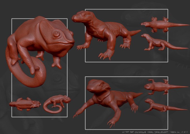
3D Modelling
I’ve found a board on the FZD School of Design website which has many 3D models, which are all presented on boards like they’re ready to be exhibited, this is the board I’m talking about, from that board, I’m going to select a few pictures and break down why I like them and how they could influence my presentation.
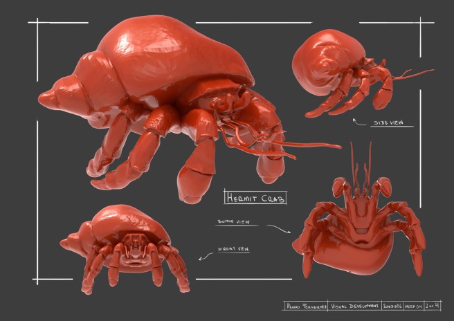
I like this because of the detail in the crab, I also love how there is a white boarder around this crab, and the model overlays the boarder, so part of the boarder is erased, I think this is a really nice idea.
I also really like the presentation of the model at bottom view, front view, side view and 3/4 view, which gives us a proper look at this crab.
I don’t like how everything on there was hand-written, I would understand if the text was hand-written on a piece of concept art, but 3D art isn’t as sketchy as concept art, so it would make more sense if this was annotated using text and fonts instead, and I feel it would look a lot nicer.
I don’t like the background colour, it feels too plain, since the text is also white.
But it makes sense if you wanted the model to stand out.
I think the boarder for this picture stands out the most, it’s very nice looking and gives a sketchy-concept feel to the piece, it’s better than having a boarder which is just drawn with a rectangle vector since this gives the more ‘free’ feeling vibe, which I don’t think is beneficial having on 3D modelling boards, but a lot more beneficial on 2D concept art, like I have already stated.
I would most likely borrow ideas from this like the boarder and (maybe) the written text for a concept piece, instead of a 3D modelling piece, since I feel like they would fit in the best that way
From seeing this piece, I would avoid written annotations altogether since I feel like you need your text to be as clear as possible so it can be read and understood quicker and easier, some of this text I feel is hard to read, and if it’s hard to read, you will make a person either loose interest in trying to understand your product or get frustrated, and if this was at a popular convention and someone was trying to read your name on a hand-written piece, they may not be able to see you if they can’t clearly see the writing!
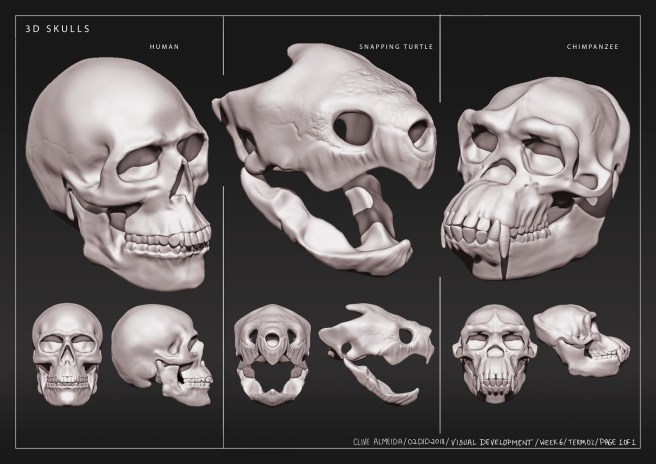
I like this work because it is presented very constantly throughout the page, with 3 different models shown in detail on the divided page, this is good because usually, you would only have one model on one page with those rotations, but this person has managed to put 3 models in, and in a way that doesn’t looked crammed!
I really like this, and I like his use of boarders and labelling, I think the small font really fits in and makes the piece look neat.
Again, I don’t like the plain colour of the background, but in a way, I think it works, to make the piece not look over-crowded, but I do think a gradient would’ve looked better. The reason for this is it’s exactly the same as having a white background, it makes the piece feel less busy, and you want to make your piece feel as busy as you can to make your board stand out more, but this could be a good thing for some people work to have a less busy background to keep the style consistent, it really is up to you deciding youself and experimenting.
The board stand out because of the presentation, how the 3 models are fitting on the page, the neat boarders, and the font which fits really well.
These all stand out because they all fit in what I would categorize as ‘neat’ and ‘organized’, starting with the font, it is a easy-to-read font, which is all scaled to the same size, width and height, this font is all equal along the board, the title being slightly bigger than the annotations, the boarders are not sketched boarders, like the previous picture, they come from a rectangle which has been drawn in, which I feel fits a 3D model a lot better, since it’s refined, and the presentation is neat and organized, all of the skulls are the same size on all three renders for each head, which makes this piece easy to look at and understand, and perfect for presenting a 3D model.
This makes it stand out in comparison to the others because of it’s readability which is vital for having in all of your portfolio pieces.
This would help me with presenting my models neatly on one exhibition sheet if I have multiple models which I want to present, which may be the case since I am limited on boards since I’m doing programming.
I would try to avoid the use of different fonts like this person has done on the bottom right hand corner of the work, since it feels very out of place, if I find a font, I would stick to that font for all of my boards to keep them consistent.
I like this work because, like on the picture beforehand, multiple 3D models are being presented, all with consistent scaling and placements, this one isn’t as consistent as the previous piece though, this person had one model which is slightly bigger than the other two, since I’m guessing that is their favorite model and the one they want to show off in their work the most.
I really like how in the background of the board, they have a larger, transparent image of the models, which is good because it isn’t a blank boring background, it fills up the empty space and is better than it being a blank grey space
I don’t like the boarders, the boarders look far too harsh for this piece, although they’re shapes like in the previous one, they’re all the way around and behind the model, I think part of the rectangles should’ve been erased so it’s not all the way around and the model isn’t overlapping anything underneath.
I also don’t like how there isn’t any annotations, the piece feels very empty without this, it would’ve been useful to have annotations of what animal the model was of, or what perspective point the creature was in, since it might not be too clear on first glance.
The similarities of the two models on the right stand out the most to me, and this isn’t for a good reason either. These models look too similar that they stick out like a sore thumb and make the overall piece not look as good.
This stands out because of how different the model is on the left from the other two.
This is beneficial to see because I want to try to not do this whilst I’m making boards for my game, so if I have any models which look similar, or are the same thing but slightly different, I want to avoid using multiple of them, so I have more variety in my 3D modelling board.
Another thing which stands out is the thick boarders, they don’t look good on the picture at all. These stand out because they’re thick and brightly coloured unlike the desaturated red colour of the 3D model.
This is beneficial for me to notice because in my final presentation, I want to avoid white boarders since I feel like they don’t look good at all.
One last thing which stands out is the background, and how there is a slightly transparent render of the 3D model in the back, this is a great way to fill up background space and make your picture look more busy than if it were a blank colour, it stands out because it’s so subtle, but you can notice it if you look at the picture from a distance, this is beneficial if your picture has a lot of blank/white space which you don’t know what to fill it up with, it could also give your work a ‘professional’ looking vibe.
This would help with my planning because I would have a better idea of how to present multiple 3D models in a stylish but neat way, without using up a whole singular board for one single 3D model.
This would also help me with my planning because I know it would look really nice to have a transparent render in the background of my picture to fill up more space and make my boards feel more occupied, this technique could also be applied to concept art too.
In conclusion, I would avoid using thick white boarders in my final presentation since they’re very distracting, and I would also avoid using models which look similar to each other.
